Smart Home
A personal project undertaken to hone my interface design and interaction design skills.
Overview
Context
This was a personal project. My focus here was to learn how to use Sketch to create design systems that are modular and scalable, and how to use Principle to make prototypes interactive. So I picked up Greg Rog's awesome courses to master the fundamentals as well as gain expertise. This project was the outcome of working hands-on on a fictitious project to implement the new knowledge gained through his video lectures.
Timeline
November 2019 - January 2020
Team
Solo
Tools
Sketch, Principle
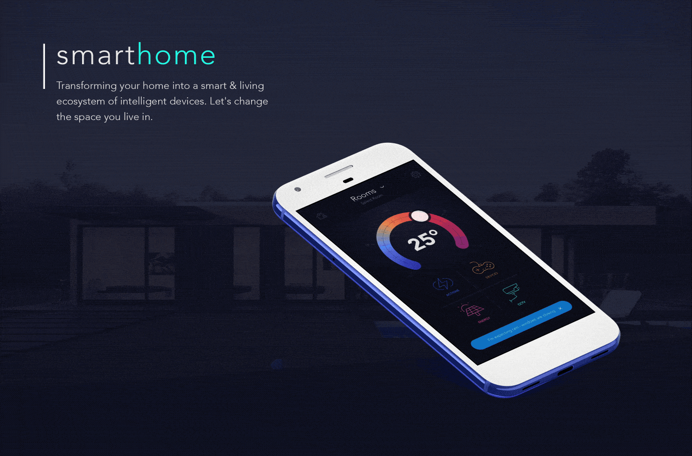
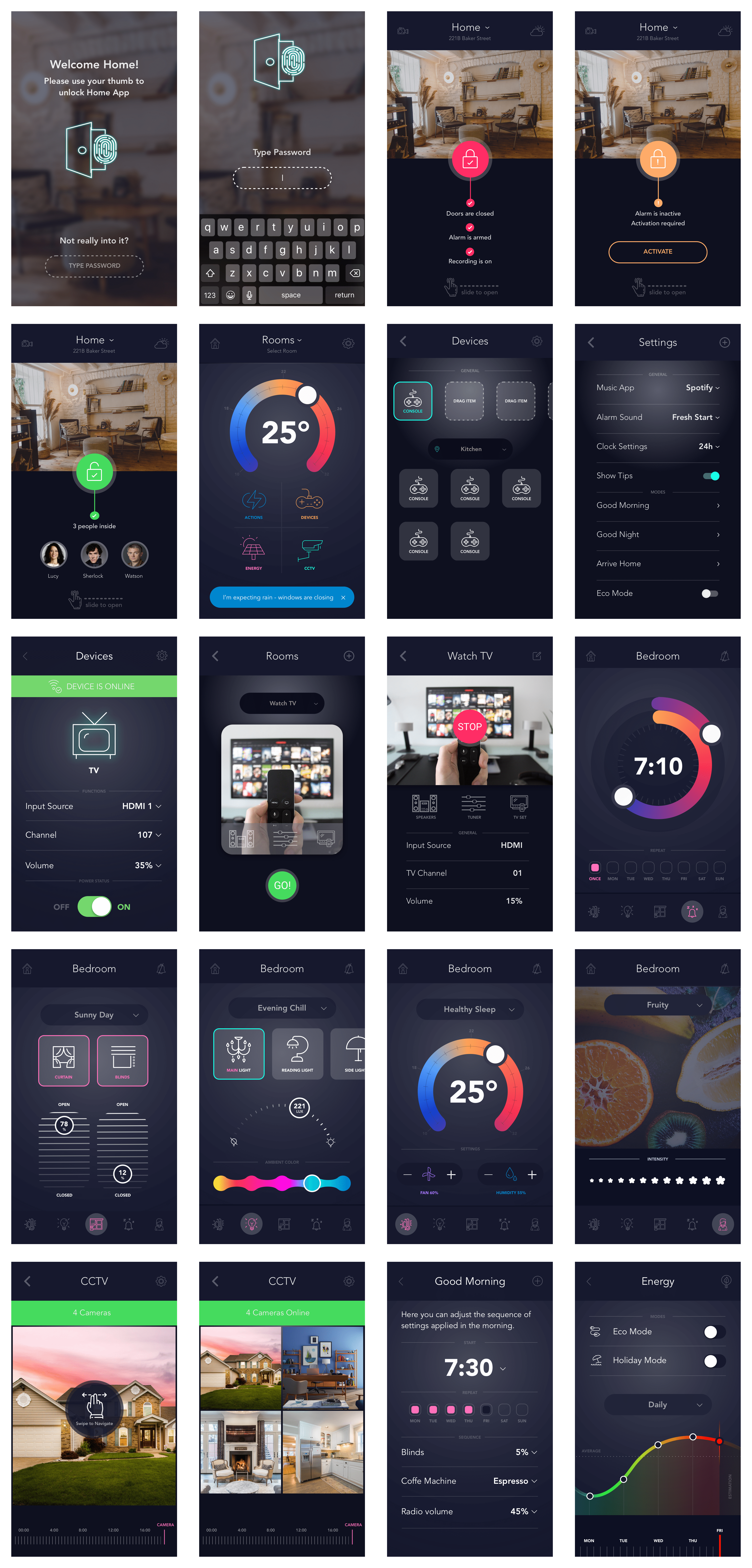
What does the Smart Home mobile app do?
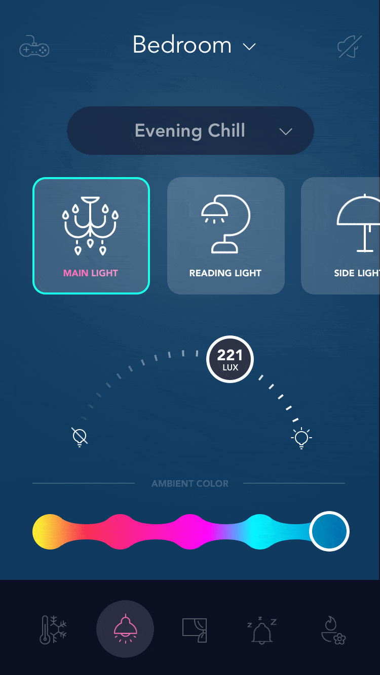
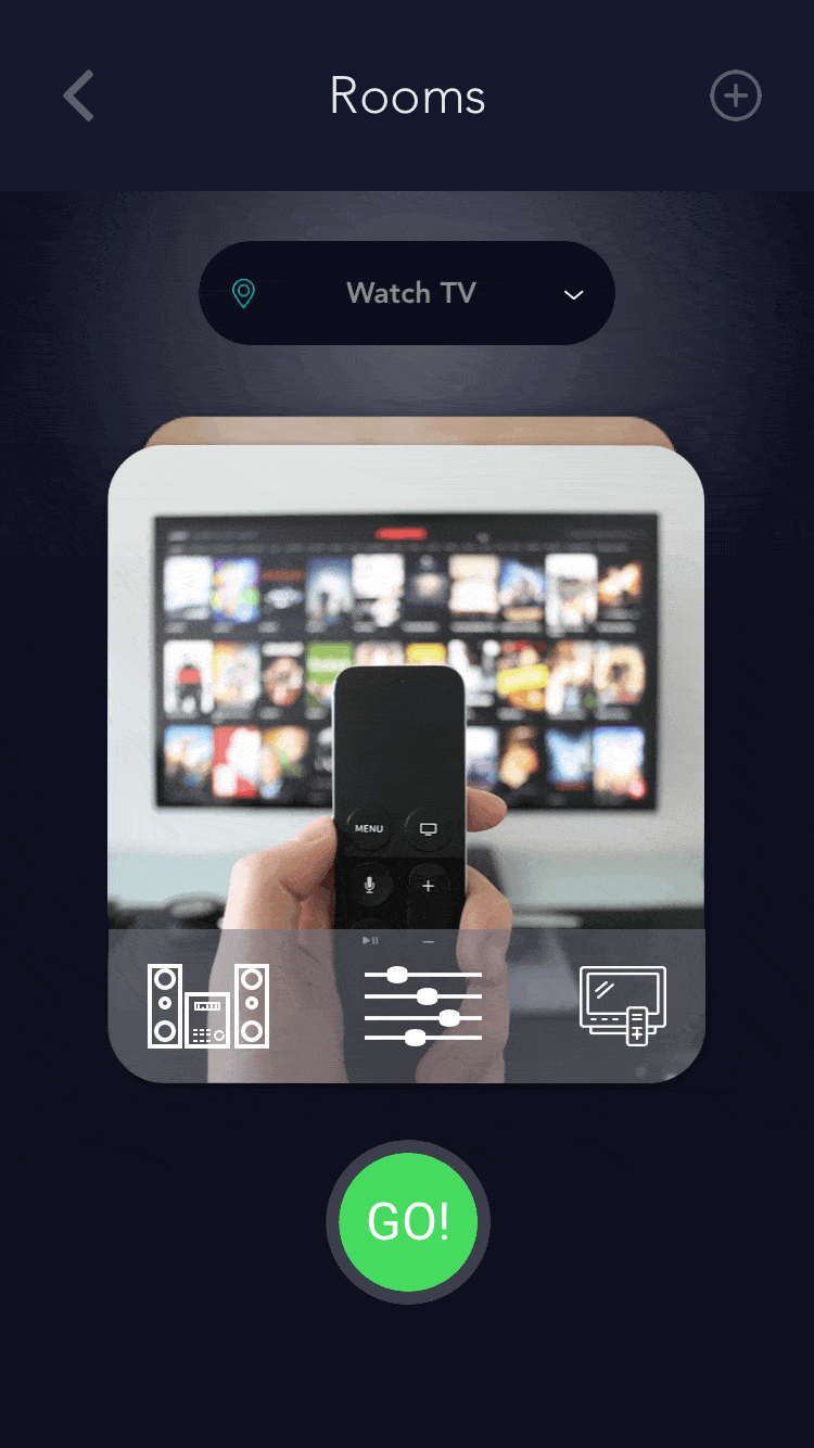
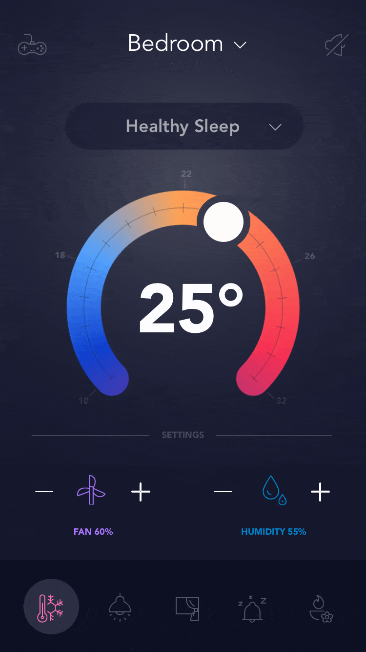
It is a simple all-in-one security, safety and smart home solution. It can monitor home in real-time and can interact with automation equipments, (like lights, thermostat, curtains, locks, TV, scents) giving the user the power to control and automate settings.
Focus area
To learn best practices for making designs modular, scalable, and flexible to change. And also to create micro-interactions that are fun and engaging.
Laying the groundwork
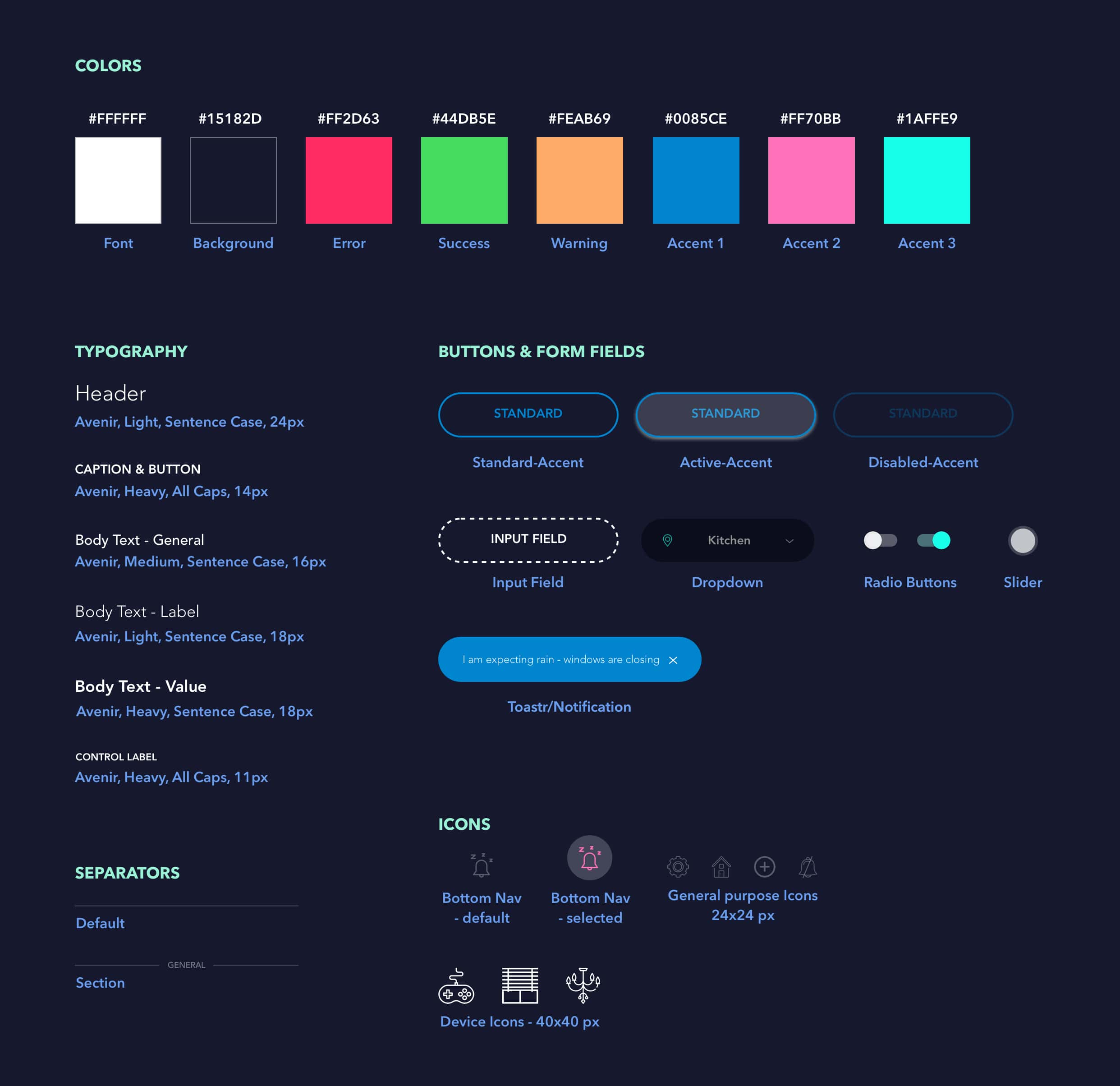
Styleguide
Designing for dark interfaces come with their own set of challenges. For instance, contrast is a big issue. So avoided using pure black (#000000) as the background color as that would strain the eyes. For the same reason, also avoided using pure white (#ffffff) as text color. While white is very good for reading against dark interfaces, I manipulated with its opacity to lessen strain. Other than that used desatuarted versions of state and accent colors to cause lesser strain. Additionally, buttons have been categorised based on their function (standard, accent, warning, etc), and their state (standard, active, disabled). Lastly, used flat, front-facing, monochromatic icons.
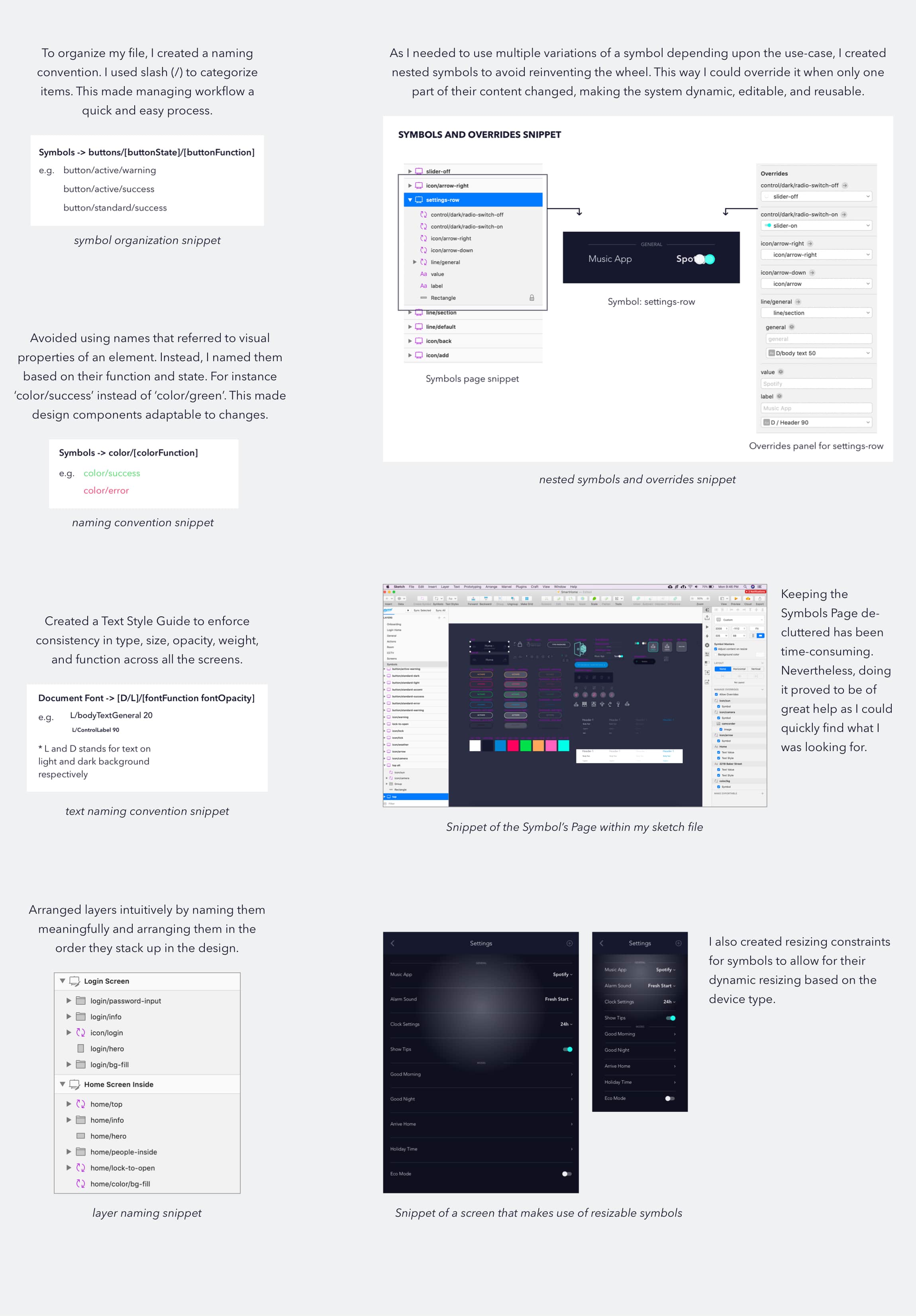
Naming convention & design components
Here's some of the snippets of the Design System I created to promote consistency and scalability.
Sample Mockups
Prototypes
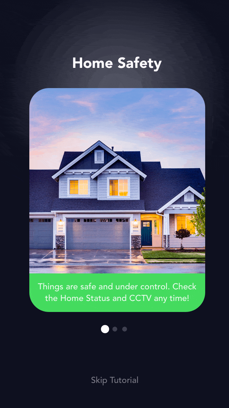
New user onboarding flow
Card Swipe, parallax flow
Bottom navigation transition
Micro-interactions