Yes Network
A seamless game-streaming and sports content viewing experience across 8 platforms.
To comply with my non-disclosure agreement, I have omitted and obfuscated any confidential information in this case study.
Overview
Context
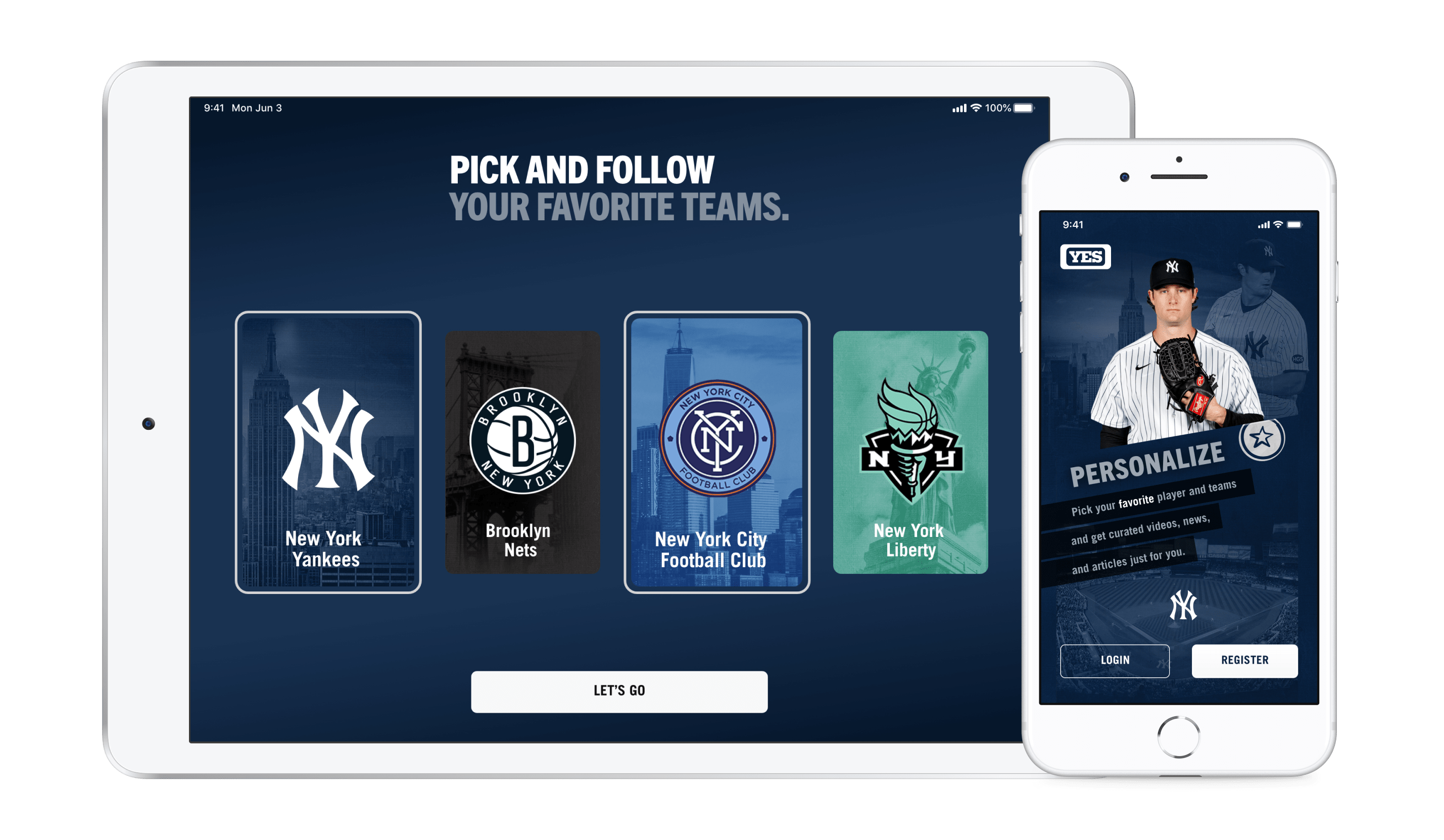
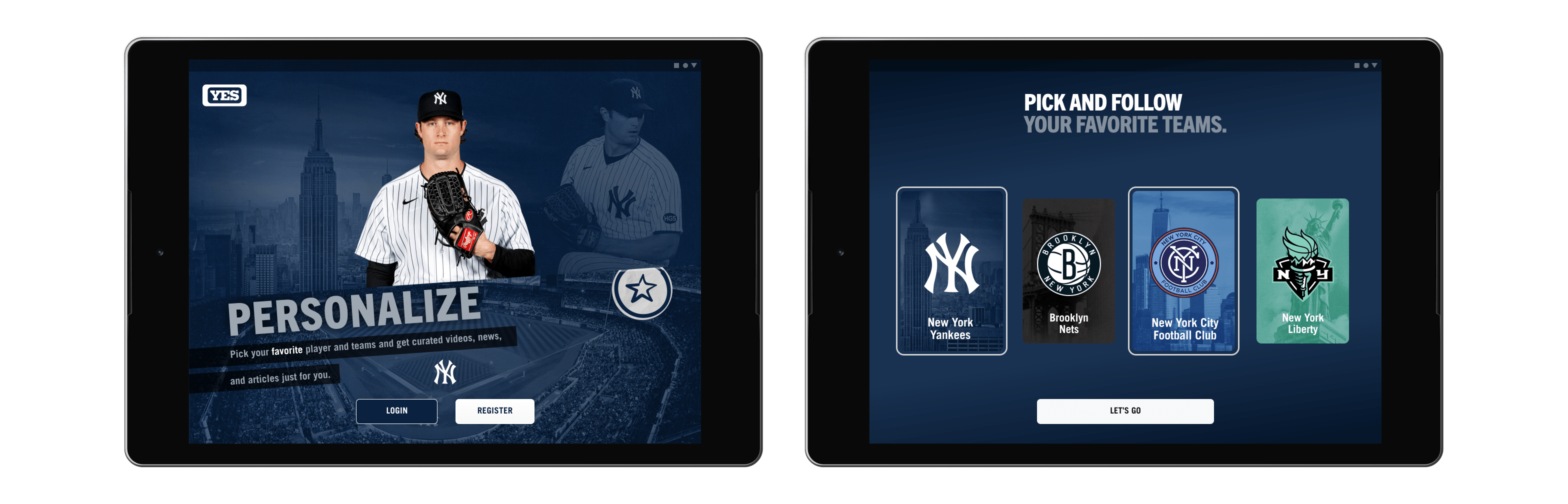
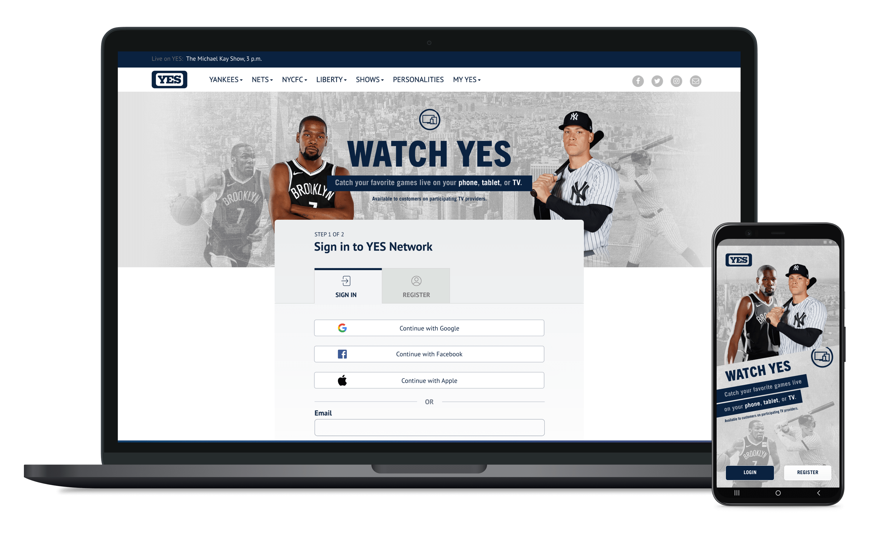
The YES Network app is a daily digital destination for the fans of Yankees, Nets, NYCFC, and Liberty, who want to consume timely, relevant, and engaging sports content of their favourite teams. The app provides a seamless game streaming and sports content viewing experience from anywhere and on any device.
Right from uncovering insights, translating concepts into features, balancing user needs with business goals, prioritizing and negotiating features for current launch and beyond, and aligning stakeholders to get buy-ins - our team worked in a highly collaborative, agile enviroment and under a very ambitious timeline.
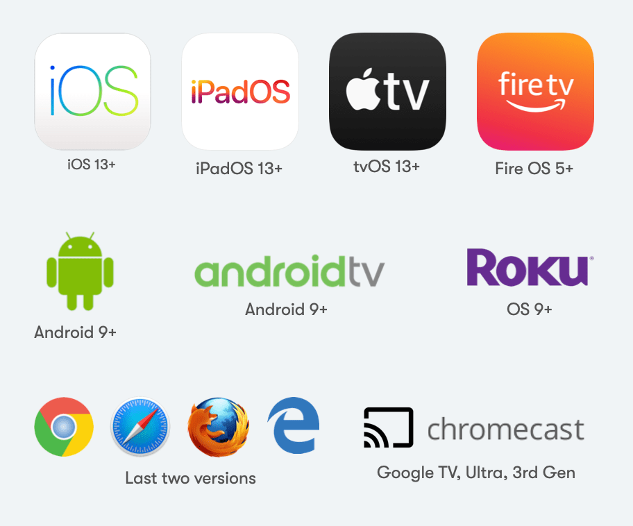
Platforms Launched
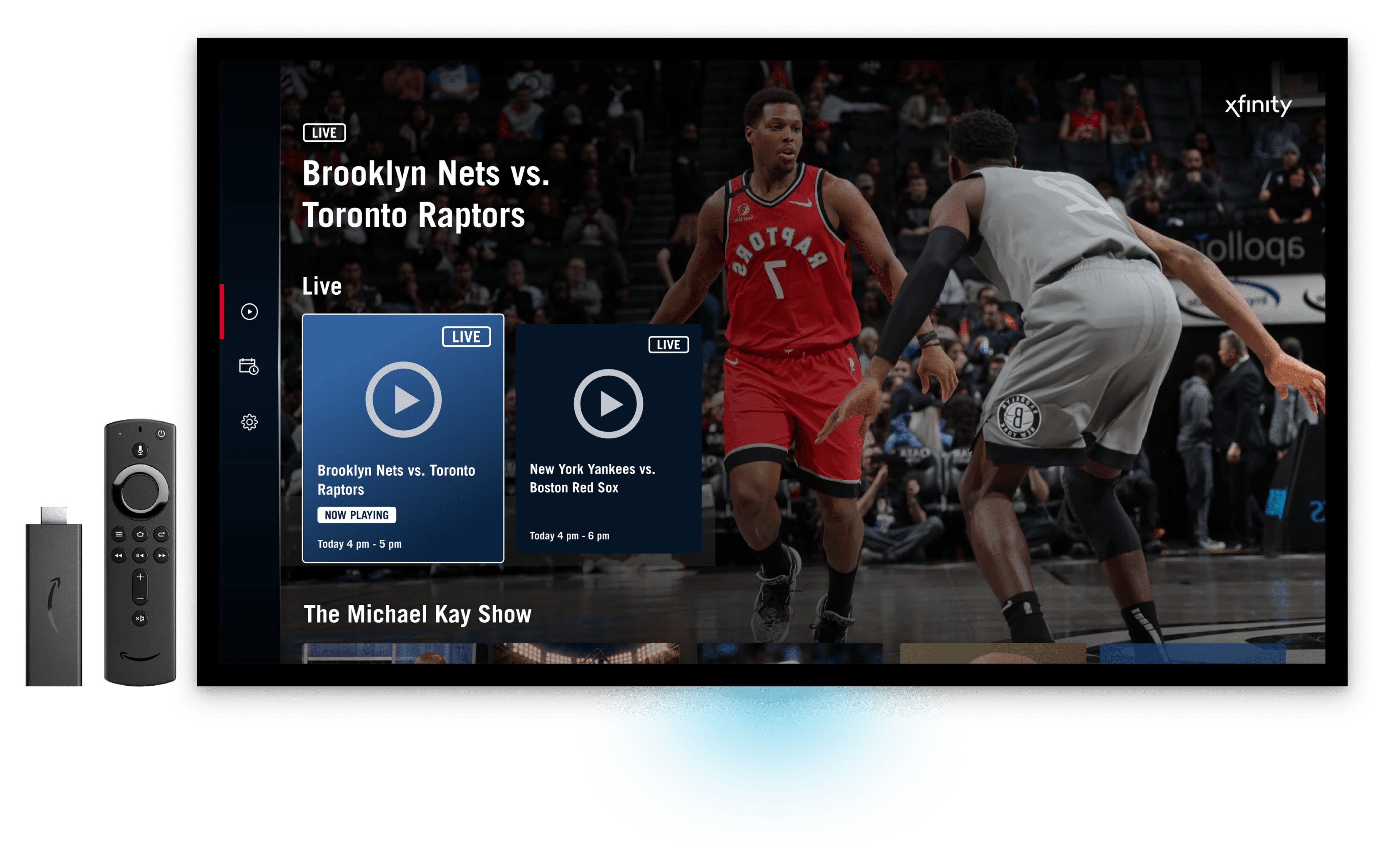
8 platforms - Android phone, Android Tablet, iPhone, iPad, Apple TV, Android TV / FireTV / Chromecast, Roku, and Web.
Client
Timeline
5 months from inception to launch - October 2020 to February 2021.
Team
I worked closely with 4 other designers - Karen, Kam, Roberto, and Chia. The design team received constant guidance and support of our manager, Morshed. This project wouldn't have been possible without the kickass engineering team, the product team, and the project management team.
My Role
UX Design for Android phone & tablet, Android TV / Fire TV / Chromecast, and Web platforms.
About YES Network
YES Network, the most-watched regional sports network in USA in 15 of the past 17 years, owns the exclusive local TV rights of the 27-time World Champion New York Yankees, the Brooklyn Nets, Major League Soccer's New York City FC and the WNBA's New York Liberty.
YES has made the list of Forbes' top 10 most valuable sports business brands in the world for nine straight years.
The Vision
Drive value and own relationship with sports fans by offering content directly to consumers
Facilitate engagement through an optimized cross-platform viewing experience
Personalize & understand fan behavior to maximize monetization opportunities
MVP Feature List
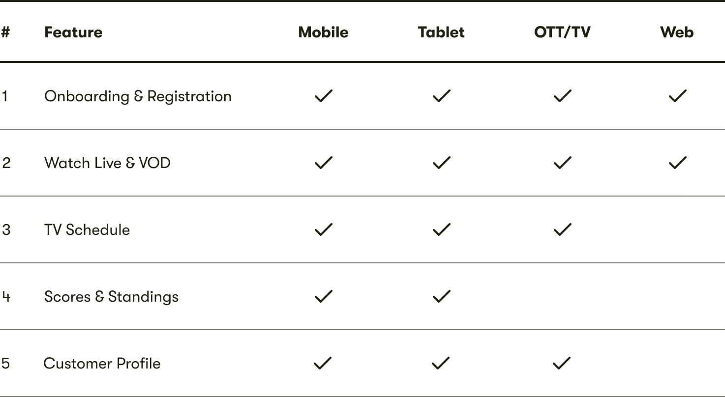
Supported Platforms
Key Metrics
Number of App Installs in first 3 months, Average Viewing Time, Retention rate, Time Spent (excluding video), Ad Revenue
The Approach
Design and development of a feature were broken down into parallel workstreams
Once a key feature was designed and approved, the engineering team began its implementation. So while the design team would design the next feature in the pipeline, we would also concurrently work with platform engineering teams to carry through the current feature through to completion.
Designing for multiple platforms simultaneously to avoid idle time for engineering
While it would have been ideal to design the product in entirety for one platform before moving on to the next, we did not have this luxary. In order to avoid any idle time for engineers and meet the tight timeline, when we designed a feature, we designed it across all the 8 platforms, before moving on to the next feature.
Remote working due to COVID-19 called for new ways of collaborating with the client
For the first two months, we had online meetings with the client every 1-3 days. This helped us to collaboratively define the product vision, and get quick feedback on the design work. It created a culture that aimed to earn trust through accountability and inviting others to scrutizize the work.
Working backwards from a fixed launch date and a tight scope
A fixed launch date and an aggresive scope called for us having to figure out upfront exactly how much time we could devote to the design of a certain feature. The time to create the right design was often the time left over.
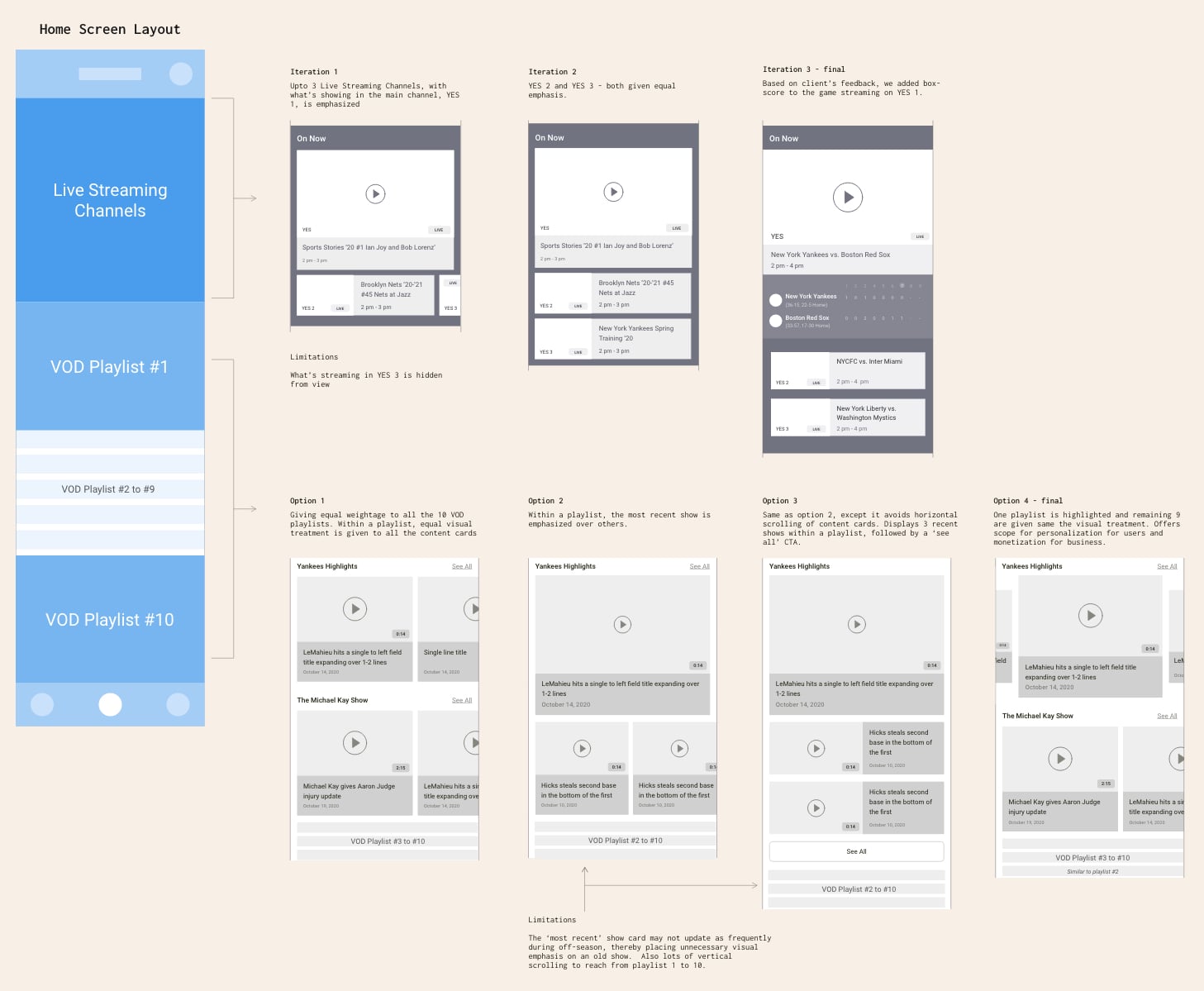
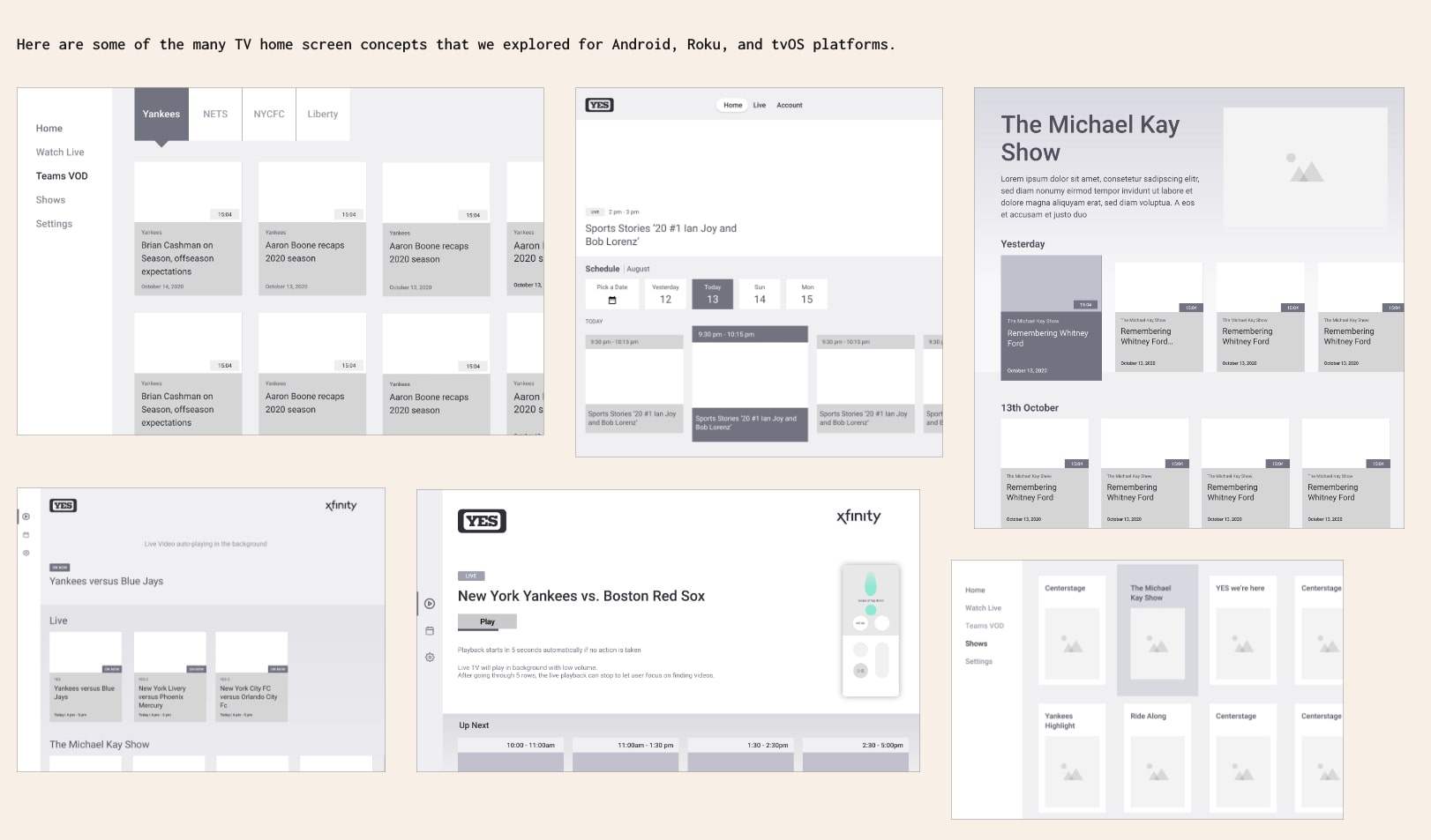
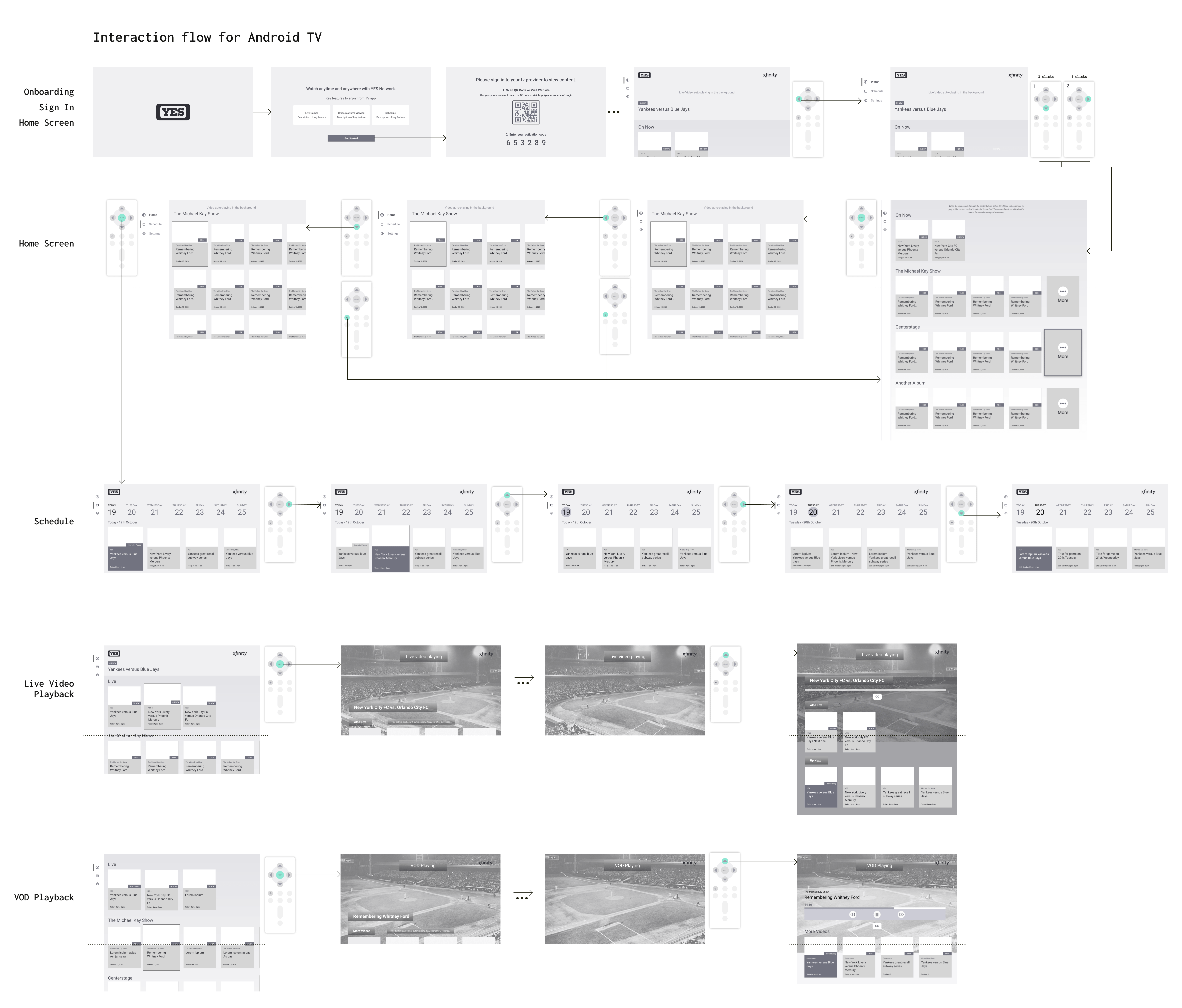
Diving In
Given below is a snippet of the explorations & iterations we did to bring various concepts to life.
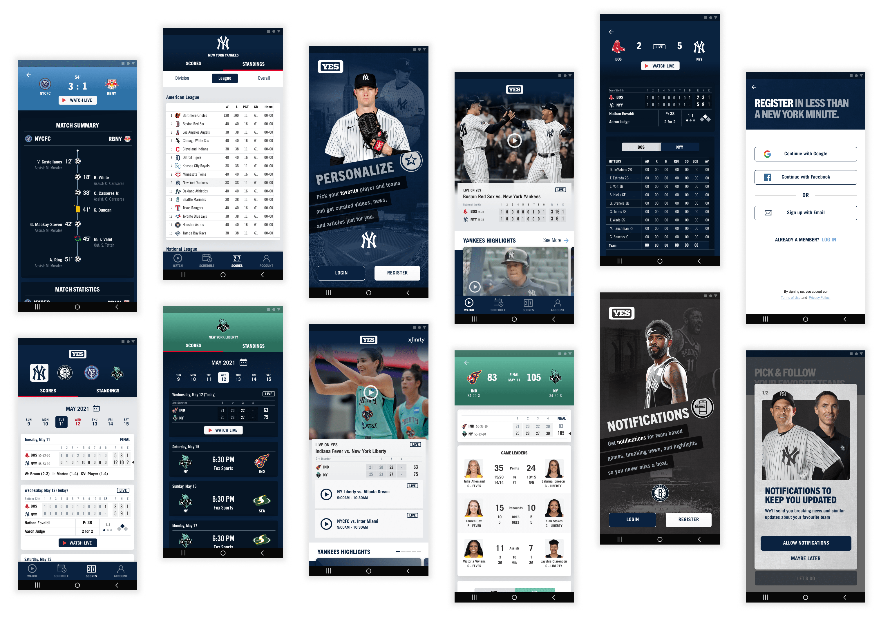
Final Designs
Shown below are some of the design snippets for light & dark mode for the Android based platforms, and the web.
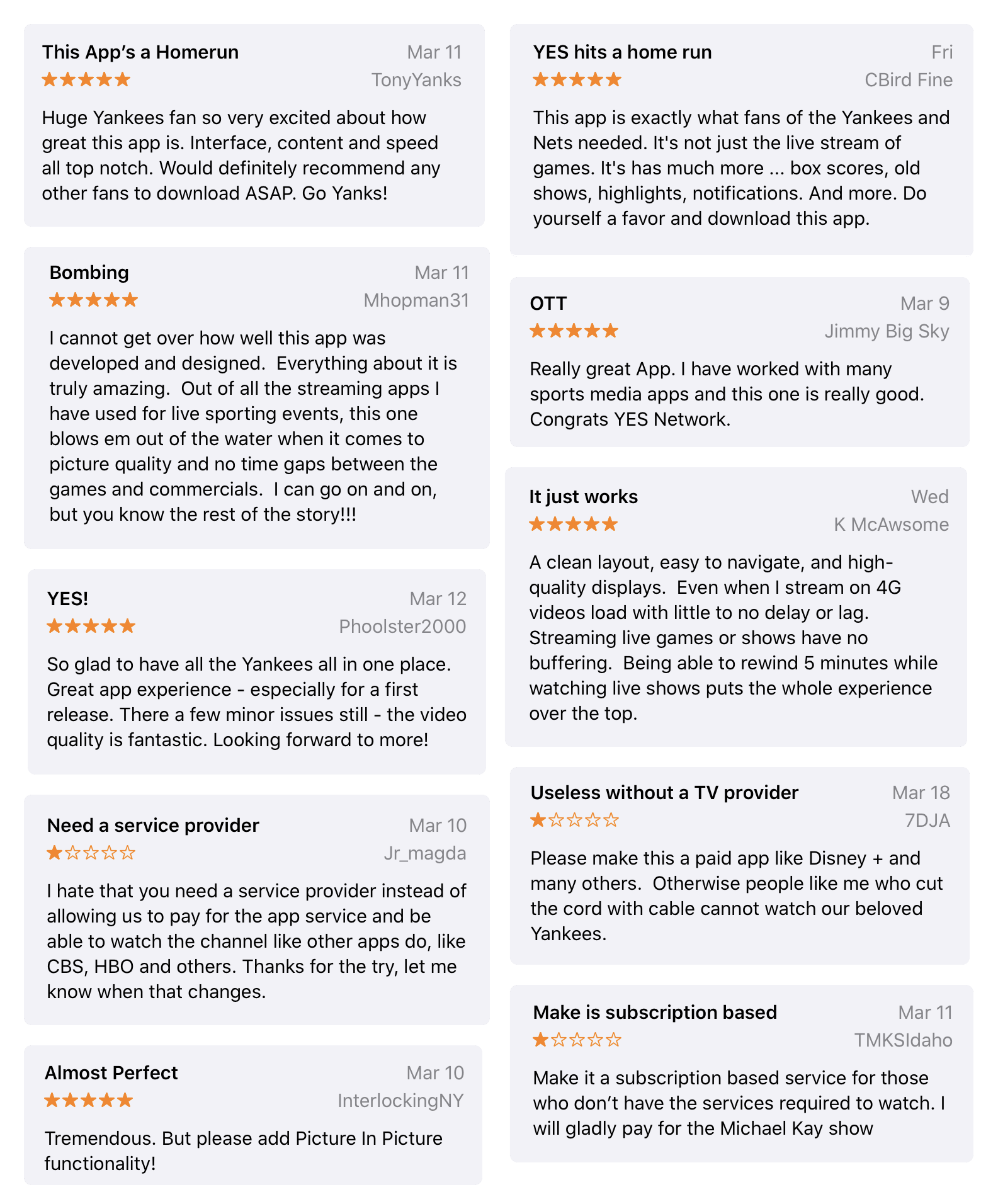
The Big Launch
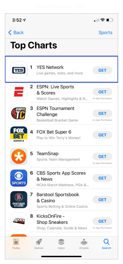
The product was launched across all the different platforms in March, 2021. During the first few days of the launch the mobile app was trending as Number 1 under the Sports category in the App Store. We got some really good words of appreciation from the reviews left by people. While the reception has been largely positive, users have been asking for more. For instance, many customers are demanding for an app-based subscription that's independent of the TV provider subscription model which we currently have. This, and many other constructive feedback left by customers gives us opportunities to improve.
The YES app is here and it’s changing the game! Stream live @Yankees, @BrooklynNets, @NYCFC and @NYLiberty games on the go and so much more! Download now: https://t.co/mSMbGRVE1m pic.twitter.com/hdGl8mPU4T
— YES Network (@YESNetwork) March 10, 2021
Reflection
On what made it possible to work within short deadlines
I had a sea of work to do within a very short deadline. This taught me to work efficiently and prioritize! As much as I believe pixel-perfection is important, I had to embrace a 'done is better than perfect' mentality for this project. Collaboration played such a key role too! It meant tapping into each other's strengths to move faster and learn quicker from mistakes. Infact, during our design team retrospection, when we reflected back on this project as a team, all 5 of us unanimously agreed that we were productive, focussed, and very proud of what we managed to accomplish.
Moving forward quickly but also stepping back from time to time
As I mentioned before - in order to avoid any idle time for engineering, when we designed a feature, we designed it across all the 8 platforms, before moving on to the next feature. This approach was extremely challenging. Ensuring that all the puzzle pieces fit nicely into a larger whole called for consciously stepping back to ensure that I was designing for a consistent, cohesive experience.
Making tradeoffs to focus on what mattered the most
As we had a fixed launch date, the golden rule of thumb we followed was to keep things simple and focus on the core functionality. We had so many amazing ideas, but we had to constantly make tradeoffs to determine where the real value was, and accordingly advance the product in more functional ways.
Learning on the job
I had never designed for a TV platform before. Moreover, since I have been watching all the television on my laptop since the past many years, I had no idea how smart TV apps even work. But I was so open to this challenge! I studied the Android TV guidelines on the go. I installed so many apps on my friend's TV and spent a considerable amount of time trying to understand the interaction patterns, the 'aha moments' and the painpoints. I proactively reached out to my teammate, Karen, and my manager, Morshed, who so patiently answered the many questions I had! I also worked jointly with another teammate, Roberto, to prototype the TV experience. Lastly, when demo-ing the work, the feedback from the engineering team also came in handy to make sure what we had designed for was achievable to build within the timeline they had. By the end, designing for TV platform became the most fun, and a part I am most proud of on this project.