Onboarding, ParticipAction
Improving the new user onboarding flow for ParticipAction mobile app.
To comply with my non-disclosure agreement, I have omitted and obfuscated any confidential information in this case study.
Overview
Context
ParticipAction is Canada’s premier physical activity brand, helping the adult population make physical activity a crucial part of their daily life. After the launch of their mobile app, the organization was facing problems related to the app’s adoption and trust. They approached Clearbridge Mobile, where I work, to help fix this problem.
For this project, other than being involved during all the phases of the design process, I was also responsible for capturing the business requirements, keeping all the stakeholders aligned, and leading the client meetings.
The Design & Discovery session was followed by 1 month of development work and subsequent launch of the redesigned feature in October 2019.
Timeline
2 weeks long Design & Discovery session in August 2019.
Team
Solo designer accompanied by a Product Owner. Both of us were led by the Director of Products.
My Role
Research, ideation, wireframing, prototyping, and design.
Client
Business Problem
Low conversion rate & trust concerns during onboarding
For the ParticipAction mobile app, the conversion rate from the number of downloads to the number of final in-app registration was low. Also, the first-time users were wary about giving away a lot of personal information during the app onboarding process.
Solution & Impact
- Redesigned the onboarding process, with a focus on making it quick, easy, and hassle-free. This redesigned solution was also cost-effective, requiring low implementation effort.
- The average time to onboard has come down by 67%.
- Drop-off rate has decreased significantly, by over 61%.
Ruling out assumptions
Too many unanswered questions called for a more thorough understanding of the problem space.
What was clear from the first meeting with the stakeholders was that the app's onboarding process was not working as intended. At this juncture, I had several questions in mind -
- At what point during the onboarding process were people dropping off?
- What was the reason for the drop-off?
- Was the app's value proposition not clear enough?
- What kind of trust concerns were people having during onboarding?
- What was the ratio between users who registered via social-login versus those who used email sign-up, given the fact that the former process is a lot easier?
All these questions felt too big to digest. More importantly, I didn’t know if I was even asking the right questions. So to rule out any assumptions, I decided to dive into data and conduct research.
Investigating the problems
To understand what was working and what wasn't, I carried out the following research activities.
A. Firebase Analytics
Analysed KPIs from the existing Firebase data - such as the average time taken to onboard, percentage of users dropping off, etc. I have intentionally omitted confidential data here.
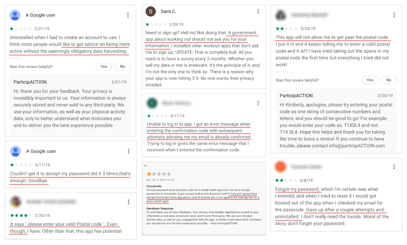
B. App Store reviews
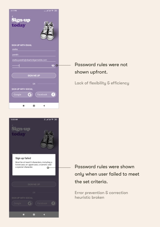
Users expressed trust concerns related to the personal information they had to fill in order to onboard. Additionally, they expressed form-filling related struggles, w.r.t. input fields such as postal code entry, and password entry.
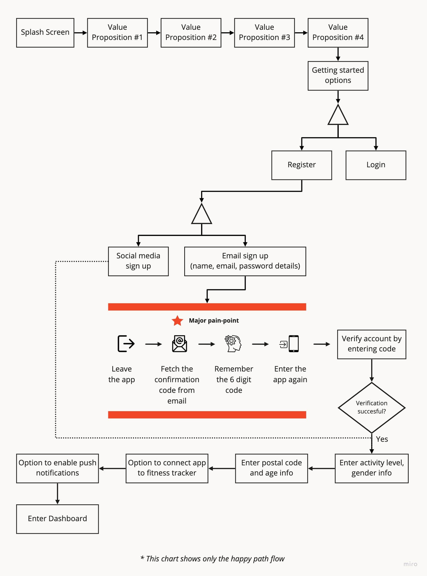
C. App Flow Analysis
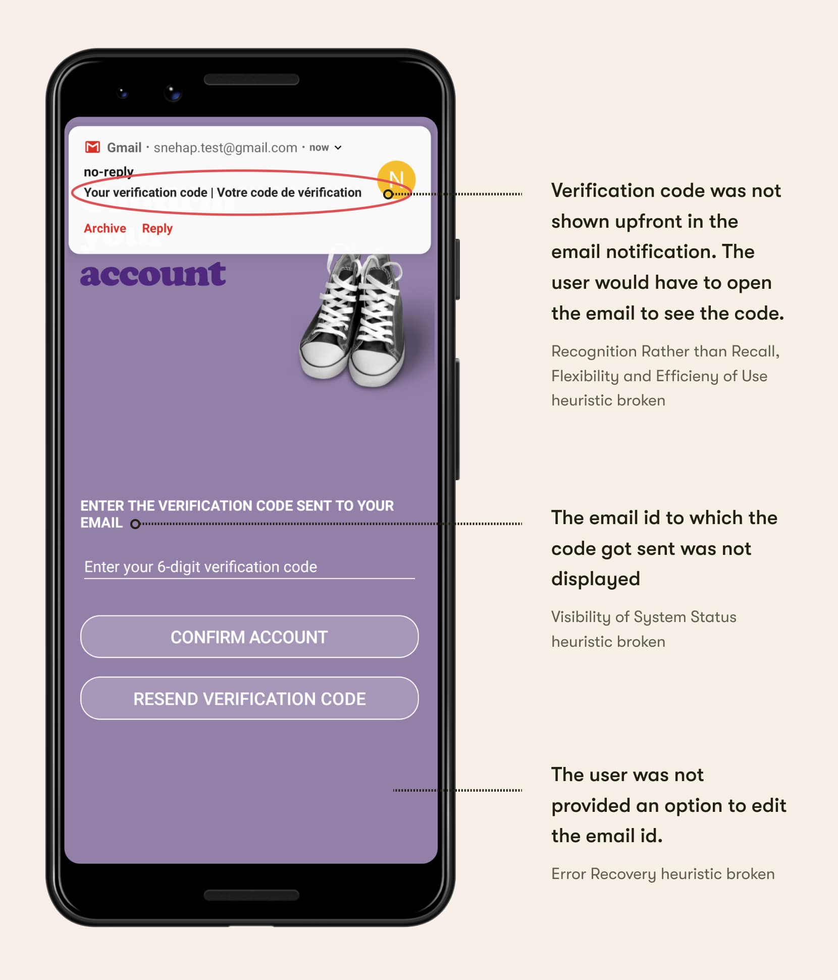
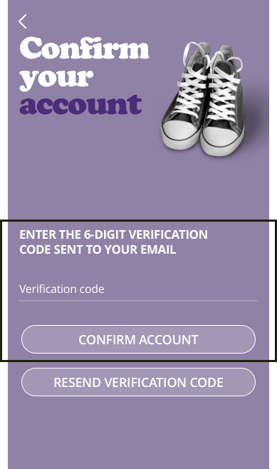
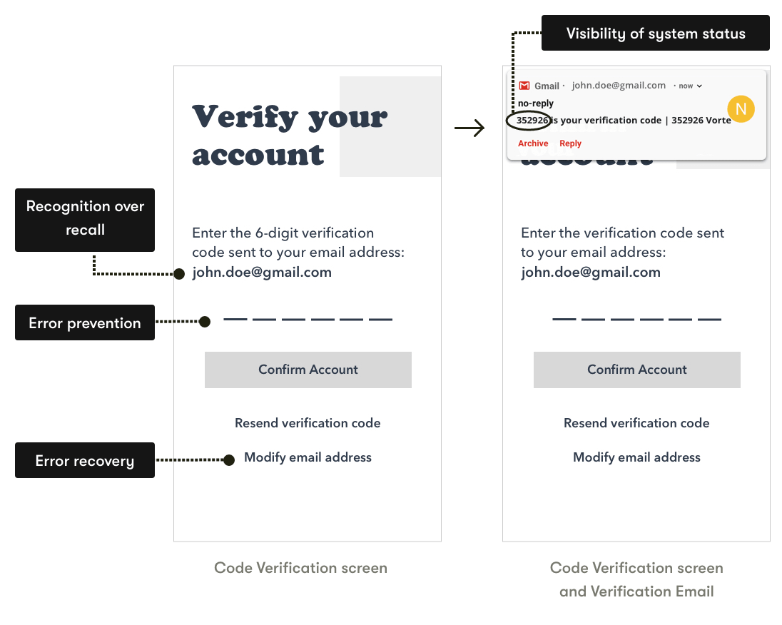
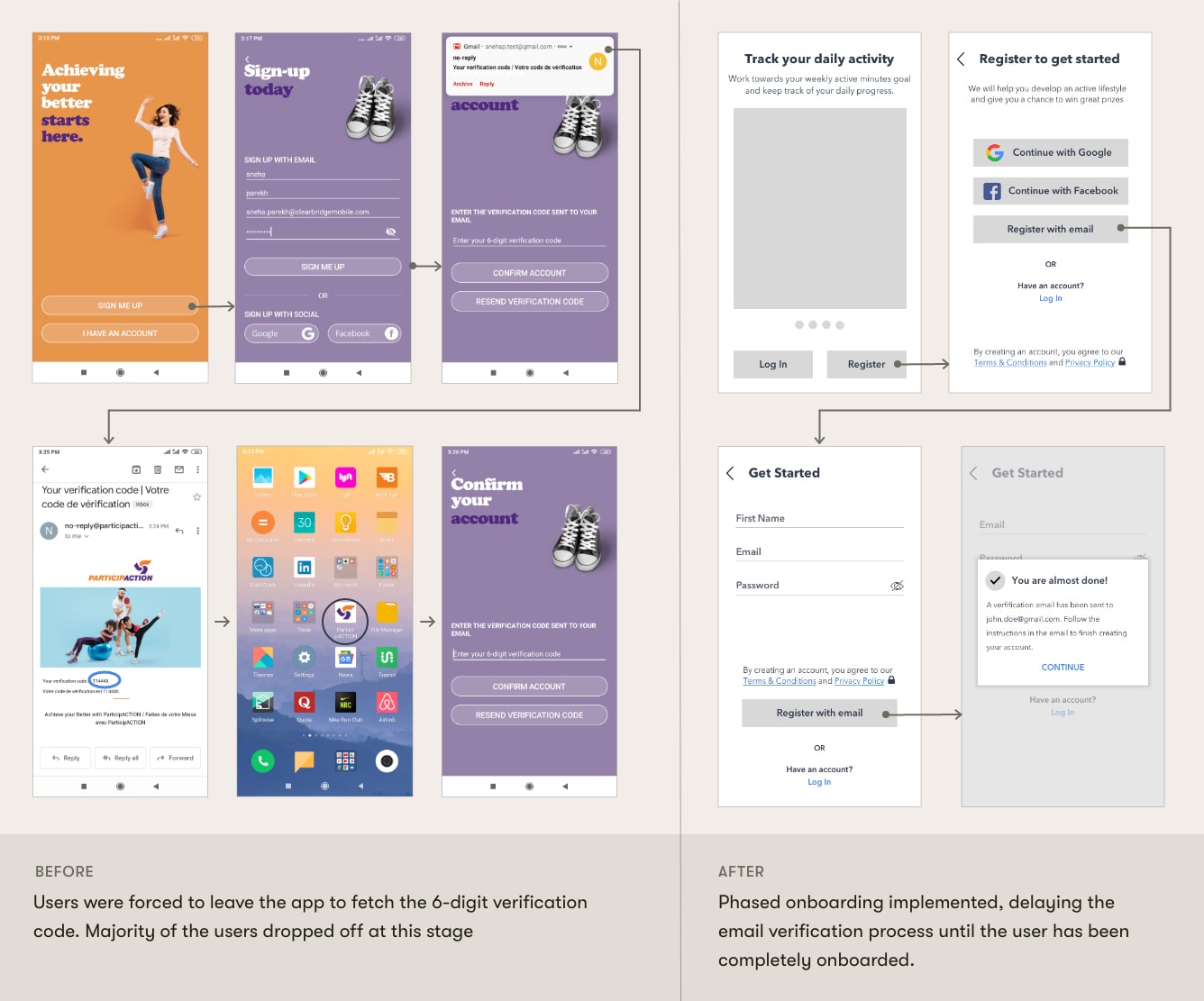
One major pain-point involved the user having to retrieve a 6-digit verification code from their email id in order to proceed with registration.
D. Heuristic Evaluation
Many heuristics including error recovery, and recognition rather than recall, were broken.
1. Important information was not shown upfront
2. Inconsistency in visual design & communication
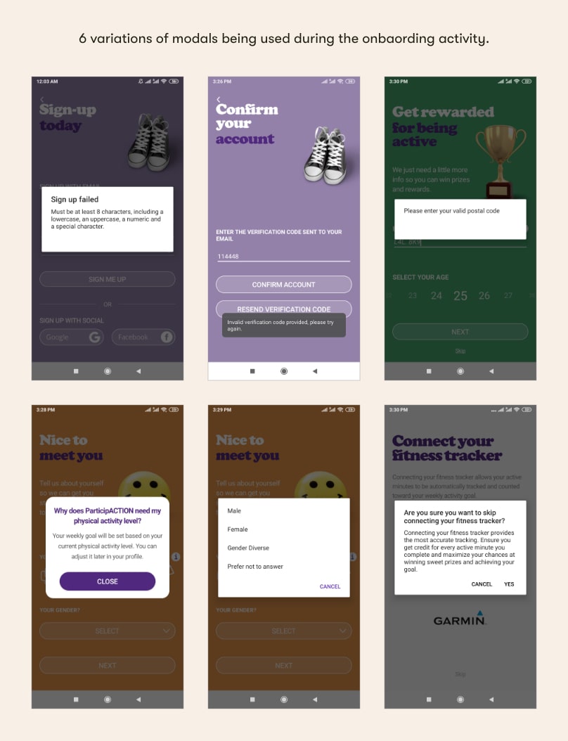
3. True intent was buried, leading to trust issues
4. Password UX was flawed
E. Contextual Inquiry combined with Think-Aloud
Powerful behavioural and attitudinal data quickly revealed what users liked/disliked, what they noticed first, things they found confusing and blocking, and whether their predictions met their expectations.
Having holistically reviewed the app, I needed to avoid the false-consensus effect, i.e. avoid assuming that other users share beliefs similar to mine and will behave just like I did when I interacted with the app. So at this point, understanding participant's interaction pattern and cognitive processes as they went through the onboarding flow was crucial to get an unbiased outlook and gain a deeper understanding of the problem.
Task
Five participants were asked to download the app, and the go through the entire onboarding flow only to stop when they land onto the dashboard.
Highlights from the study
User 3 did not have email account saved on their phone. So they signed into their email account via their laptop, to find out what the verification code was.
User 5 deliberately entered proxy email id to get done with the process. Only after moving to the next screen, User 5 realised that they had to enter a verification code in order to proceed. So they went back to the previous screen to edit and enter the right email id this time.
Reframing the Problem Statement
When I started this project, all I knew was that the client wanted to fix low app adoption and trust issues for the app. This was too broad, too ambiguous. The initial round of research activities helped me tremendously in uncovering what the deep rooted problems were. With all the data and insights uncovered, I constructed a more definative problem statement, which would be my guide for the next phases of the design process. Here's the refined problem statement -
How might we make the onboarding process less time-consuming, less blocking, and less frustrating for a new user?
Succcess Metrics
Quantitative - Conversion Rate, Task Success Rate, Time on Task
Qualitative - Customer Satisfaction Score
Ideation: finding new angles
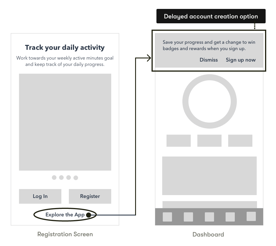
Idea #1
This idea involed not forcing registration by giving users an 'Explore the App' functionality. Users who use this route would be prompted for registration from the app's dashboard screen.
Strengths
- Lets a new user explore different features, before committing to sign-up
- Provides the fastest way to get started with the app
Limitations
- Business may loose potential customers
- Dashboard customization not possible using this technique
Idea #2
Showing the verification code upfront in the email notification so that the user doesn't have to leave the ParticipAction app.
Strengths
- Quick fix. Will save both time and implementation effort
Limitations
- Dependent on user's environment and context of use
- Several other issues uncovered during the research phase won't be addressed by this technique
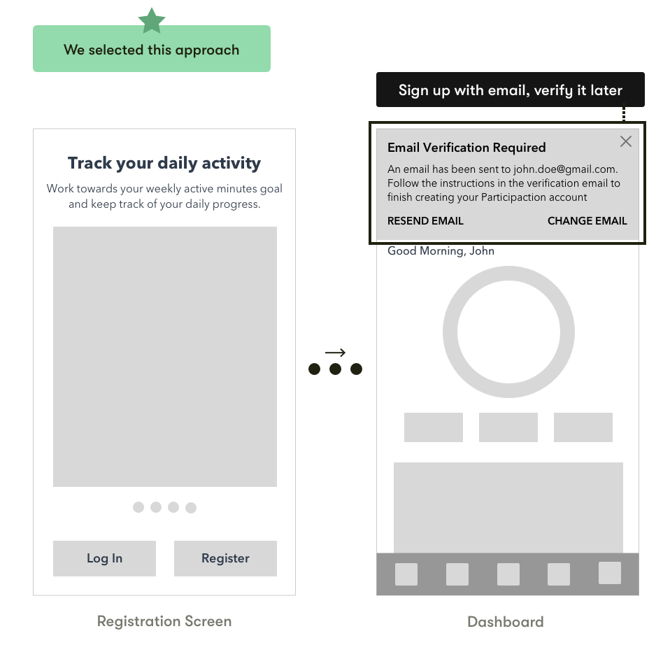
Idea #3 - Finalized
This idea involved delaying the verification of email id until the new user got onboarded.
Strengths
- Makes onboarding easy, hassle-free, and fast
- Also meets the stakeholder's business requirement of making registration mandatory prior to using the app
Limitations
- Requires more implementaion effort when compared to idea #2
Wireframing the final solution
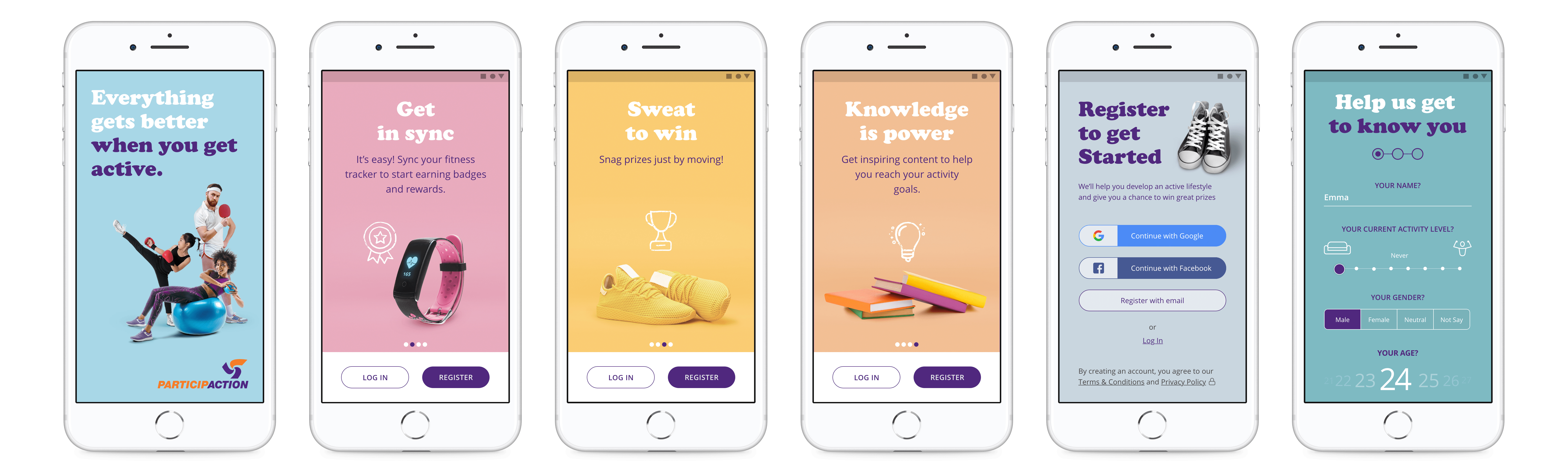
Value Proposition
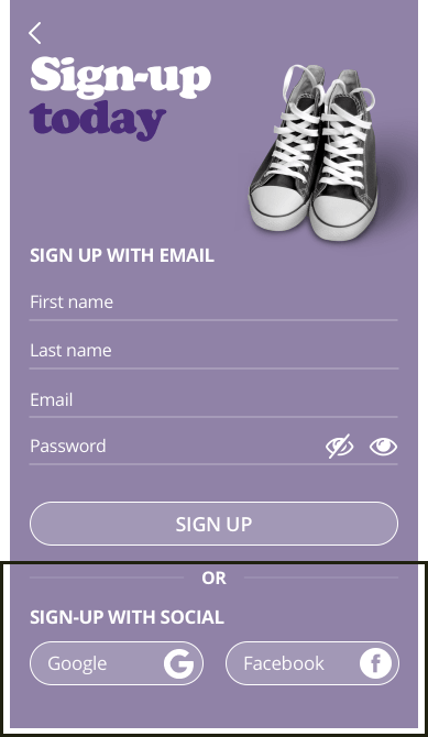
Registration
Customization
Email Verification
Error States
Design Guidelines & Final Designs
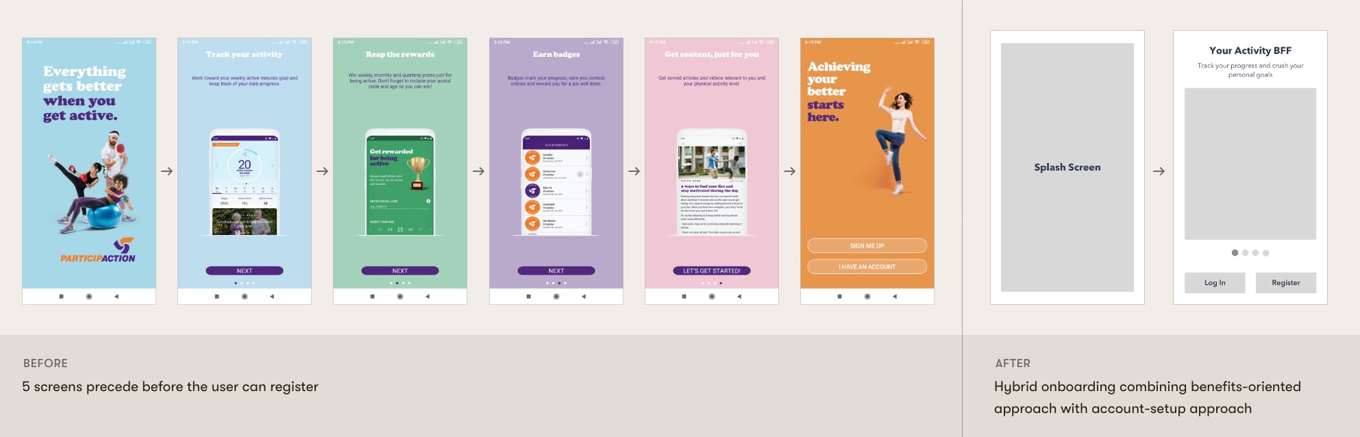
ParticipAction has a very strong brand guideline. They value bright colors, a fun tone of voice, and found-object, studio photography, While redesigning, my goal was to not overhaul their existing onboarding designs, but only to improve it wherever necessary.
Hybrid onboarding implemented, combining account-setup with benefits-oriented approach.
While some users like to go through the value proposition screens, others like to get started right away. Thus, a hybrid layout has been used to address this dual need.
Phased-onboarding concept implemented.
- Verification of email, which was the most blocking step previously, has been omitted from the onboarding flow. It has been delayed until the user has been completely onboarded.
- Social sign-up emphasized over email sign-up to offer faster onboarding.
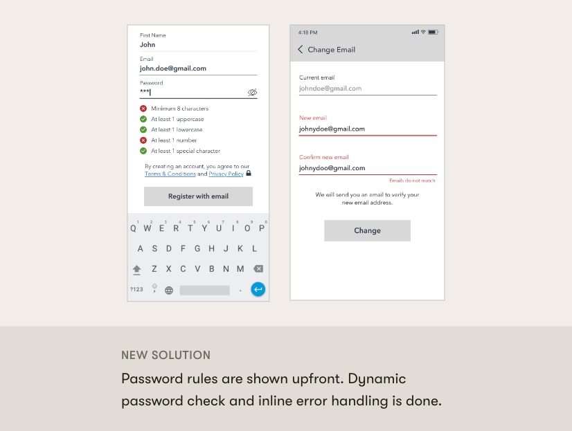
- Dynamic password check carried out to offer increased efficiency.
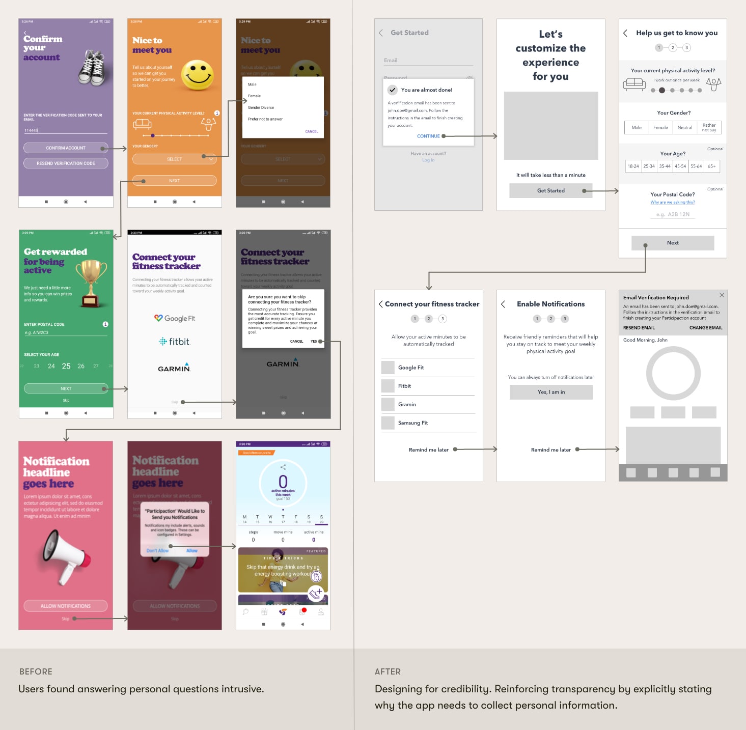
Customization process has been made more humane, transparent, and efficient.
- Customization process has been broken down into digestable steps.
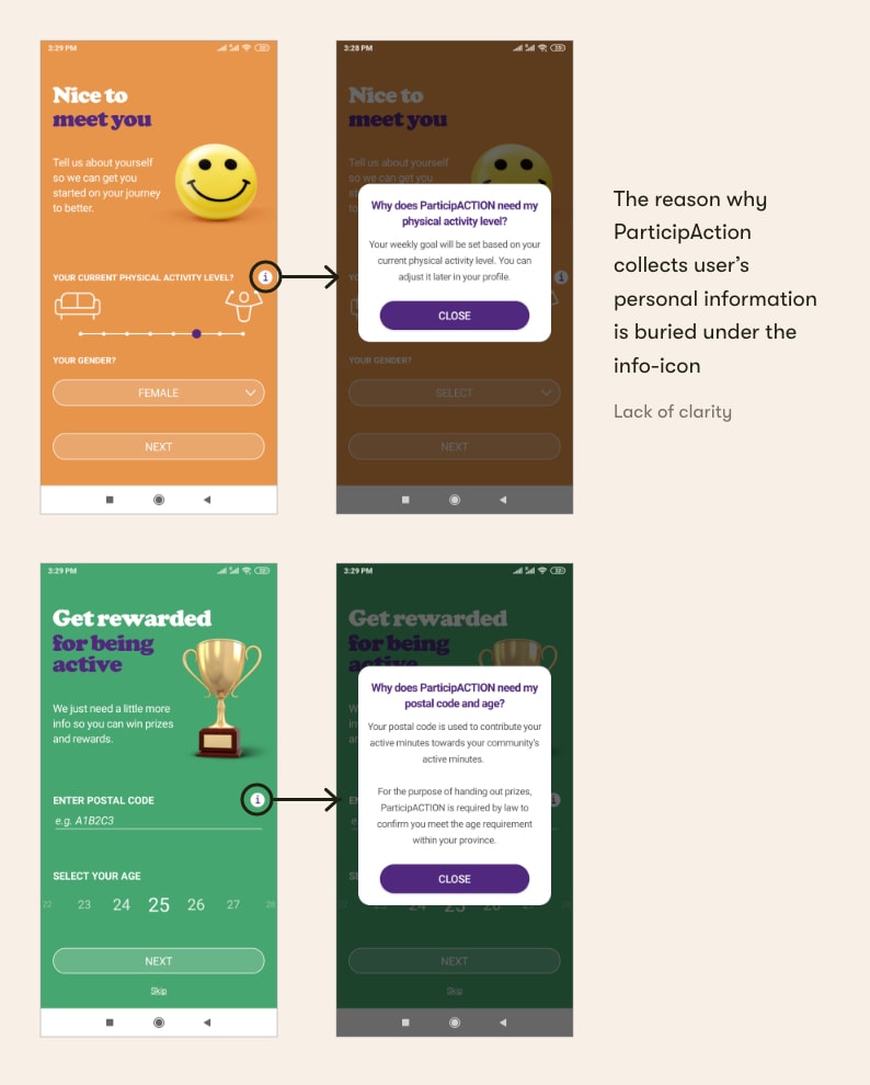
- Microcopy has been added to enhance clarity and credibility. E.g. 'skip' → 'remind me later', info-icon → 'why are we asking this?'
- Tap to select input modalities has been added to make form-filling quicker.
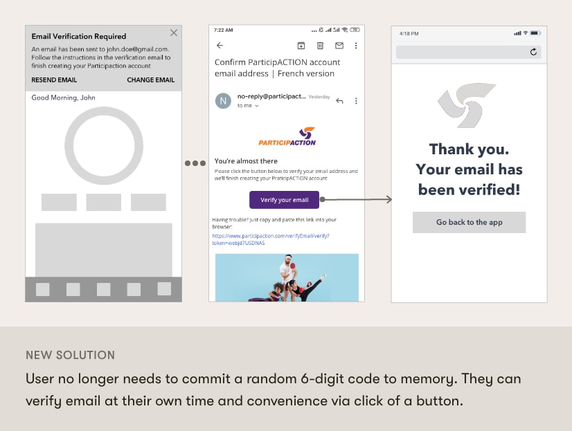
Users allowed to verify their email id at their own time and convenience.
- Cognitive load nullified as the user no longer needs to remember a 6-digit code.
- Email id can be verified via click of a button at user's own time and convenience.
- From the business' point of view, until the email id has been verified, the user is given access to limited functionalities within the app.
Error handling
- Error correction and recovery handled via change email, resend email functionalities.
- Inline error handling during from-filling implemented to provide dynamic feedback.
Business Impact
Post this work, I played a role in redesigning the Rewards & Achievements sections, which are the two primary segments within the app. Overtime, the app rating has gone up from 3.7 to 4.5 stars on the iOS App Store, and to 4.6 stars on the Android Play Store.
Reflection
One thing I would like to change
Having developed some design maturity over time I can now say that for the app permission requests, I tackled 'how' to ask the user but not 'when' to ask the user. Asking in context rather than up front during onboarding would have helped users make more informed decisions.
Do not think about solutions during the 'problem phase'
It's very easy to think about potential solutions without fully investigating the problem. I make a conscious effort not to do so. During the first meeting with the stakeholders, a general idea floating around the table was that we may have to introduce an 'Explore the App' kind of functionality to not force registration. Looking back, I am glad I kept pushing for understanding the problem first. The registration flow had so many pain-points that 'Explore the App' functionality would do nothing much but merely delay the time when users encountered them. Not to mention it would hurt the business, and also increase the developmental time and effort. It was only by investigating the problem, the real issues surfaced out. And, as it turns out these issues were less costly to solve for!
Hard-skills are important, but so are soft-skills.
All the meetings that I had involved 5-7 high-end stakeholders, each leading different departments at ParticipAction. Trying to understand and capture requirements from them and getting alignment was something I had never done before. It turned out to be a great experience. I learned how to effectively convey the rationale behind my design decisions during the discussions back-and-forth.