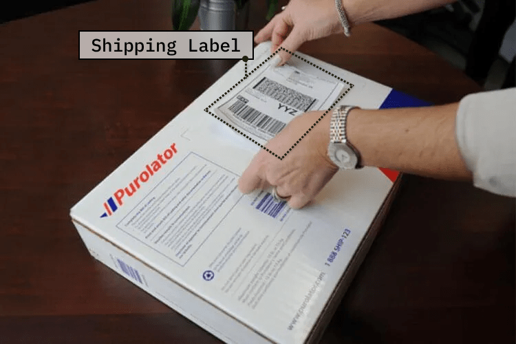
Shipment Label, Purolator
Enabling users to prepare package at home and ship it anywhere across Canada.
To comply with my non-disclosure agreement, I have omitted and obfuscated any confidential information in this case study.
Overview
Context
Purolator is one of Canada’s oldest and biggest courier, freight, and logistics companies. They wanted to build a new feature into their mobile app that makes it possible for their customers to self-generate a shipping label from the comfort of their home/office. They approached Clearbridge Mobile, where I work, to build this feature for them.
My Role
Product Design, end to end.
Timeline
4 months, Oct 2019 - Jan 2020.
Team
Worked as a solo designer with 2 engineers, 1 product owner and 1 senior project manager.
Client
Background
In an effort to give more control to its customers, Purolator saw a big opportunity to augment to its suite of features on mobile.
Purolator’s mobile app, for both iOS and Android platforms, lets its customers do a lot of things - track shipment, get an estimate for a new shipment, find drop-off locations, etc. But to send a package, customers had to visit a Purolator post-office. The staff there would assist them by capturing shipment details, generating a shipping label, and ultimately sending off the package to the recipient. Could we build a new feature within the mobile app that lets customers generate shipping labels all by themselves? This way, all the customer required to do was simply drop off the package or schedule its pick up. This new feature is what my team set out to build.
Problem Statement
How do we enable customers to prepare a package at home using their mobile device, and ship it anywhere across Canada?
UX Metrics & KPIs
User tasks: completion rate, error rate, time on task, ease of completion.
Satisfaction score, NPS, new customer acquisition cost.
Solution & Impact
- The new feature called ‘Create Shipment’ lets customers create, pay for and print shipping label online from the comfort of their home or office. If they don’t have a printer, they can use the generated QR code instead when sending off the package.
- It helps customers save both time and effort, and offers the much needed flexibility. These factors quickly scale up for a business entity, that needs to send out multiple packages frequently, adding tremendous value to their day-to-day operation!
- This feature makes Purolator the only courier company in Canada to offer shipping from a mobile app without the need for a printer (as of writing this on Feb 2021).
- Reaching 250,000+ mobile app customers.
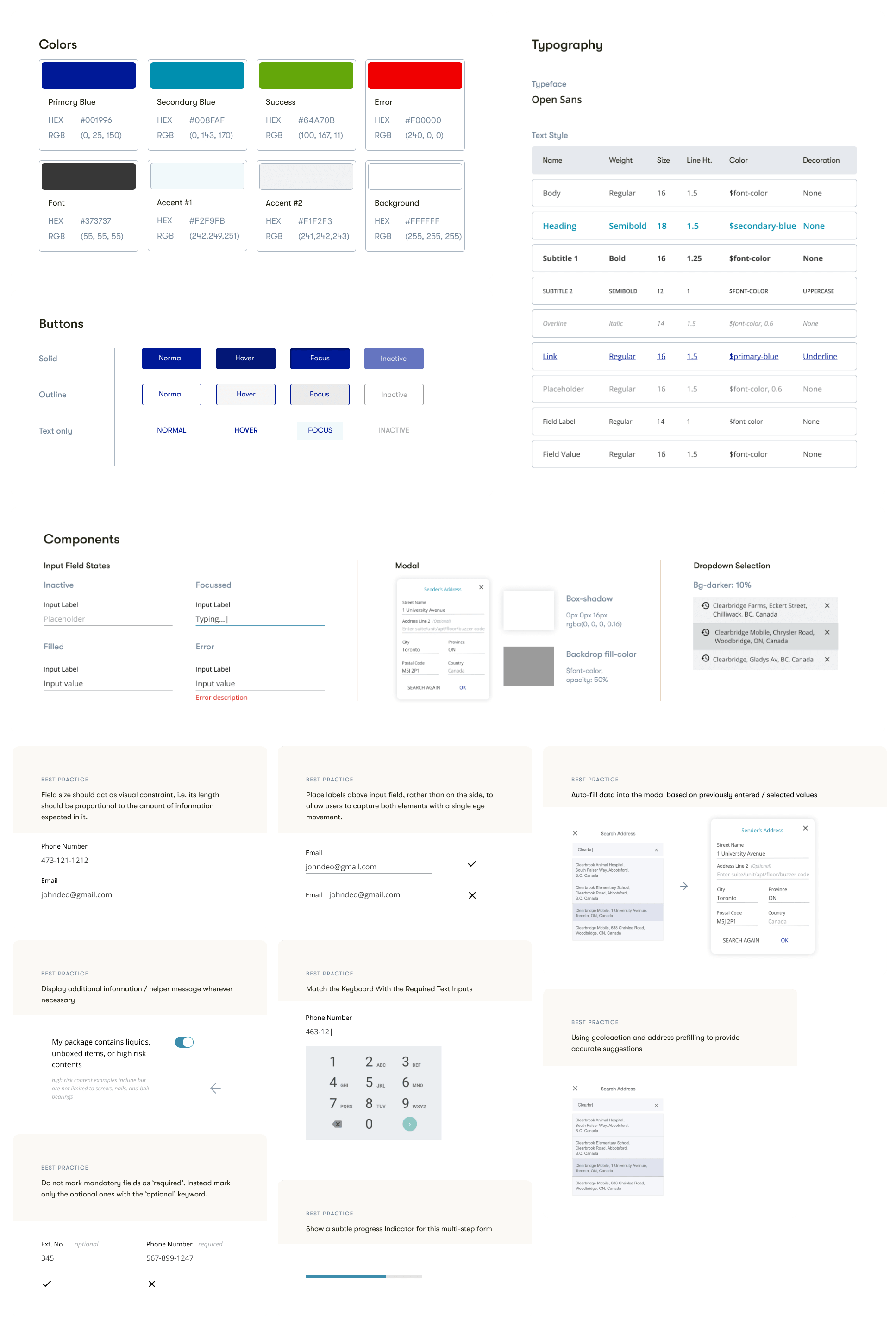
What is a shipping label?
Shipping label acts as a key identifier for the package.
Shipping label refers to a piece of paper that is attached to a package to be shipped. It contains crucial information that guides the courier company about where the package is headed. This information includes the address of the origin and destination along with the contents of the package.
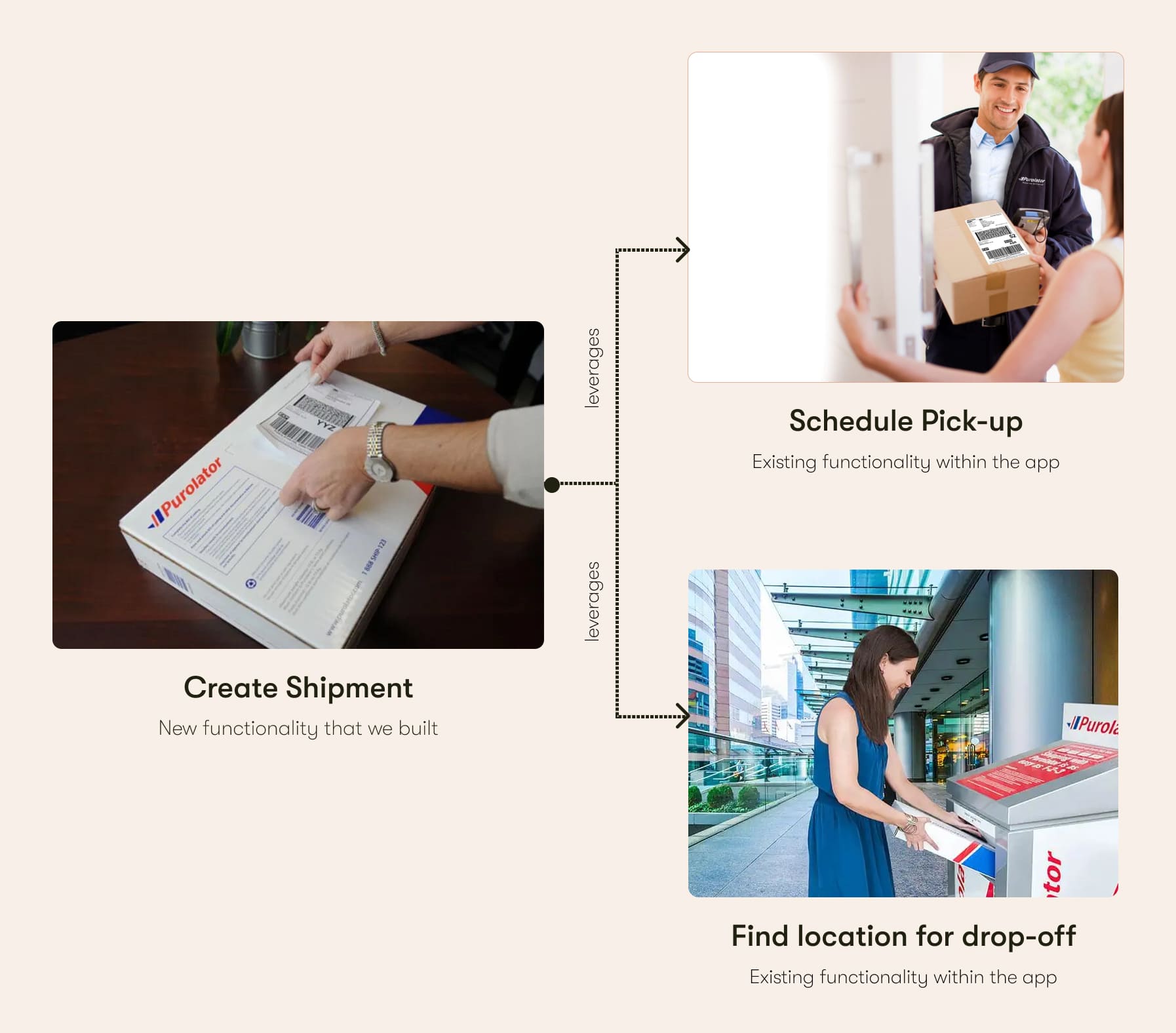
What do customers do after creating a shipping label?
The new feature ties seamlessly with the existing features within the app, giving users complete control over their shipment.
After creating a shipping label and preparing a package, users are given a choice to use any of the following two existing functionlities within the app:
- Schedule Pickup - users can schedule a pickup from the Purolator staff, requesting to come and collect package(s) directly from their home or office.
- Find Location - this functionality lets users search for drop-off locations/post office near them.
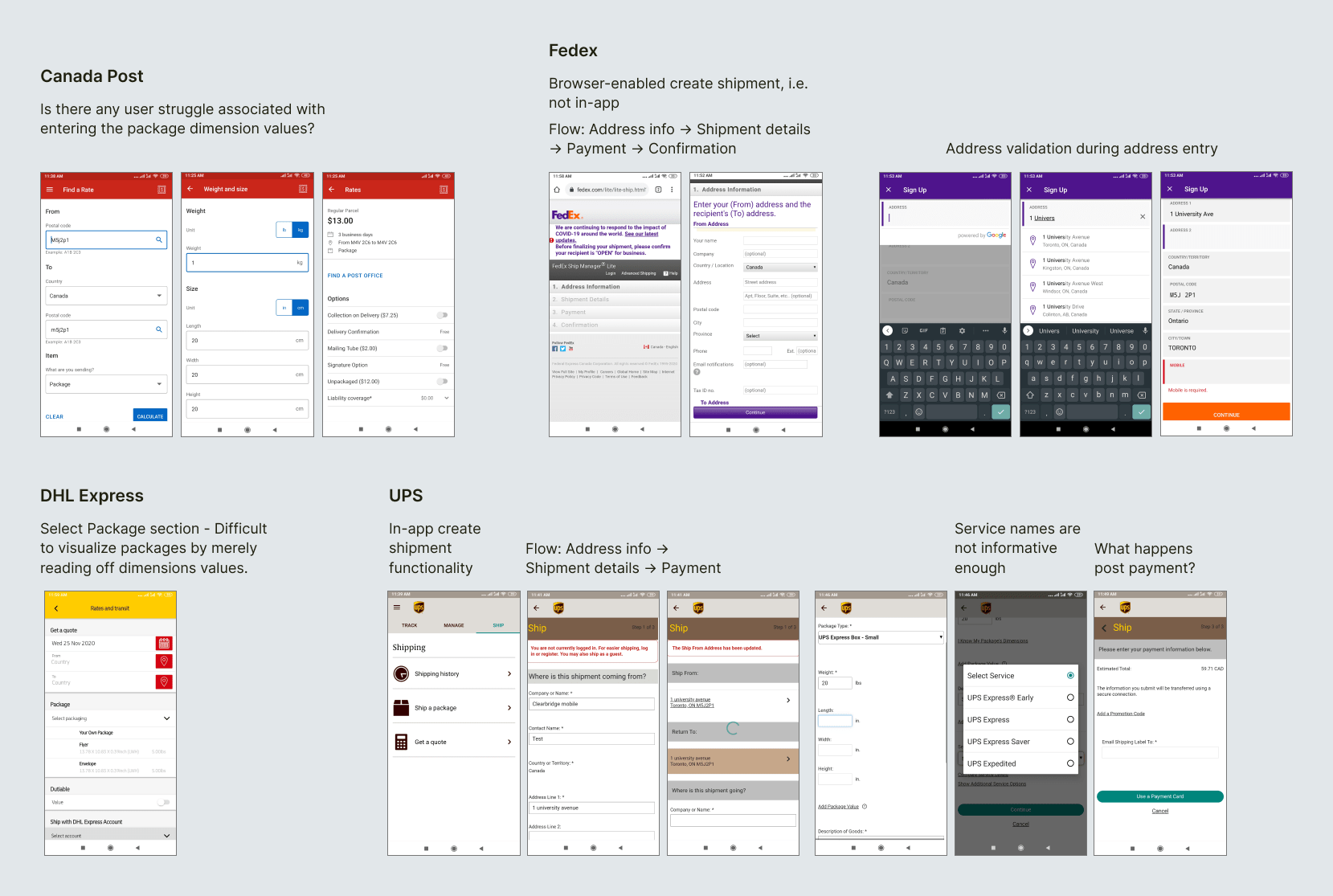
What are other key players doing in this space?
I looked at what Purolator's competitors are doing in this space. Turns out other than UPS, none of them have an in-app create-shipment kind of functionality. I nevertheless kept analyzing them, trying to figure out what was working and what kind of pain-points were felt during various interactions. More importantly, I wanted to understand how other apps were capturing an error-sensitive field like address information.
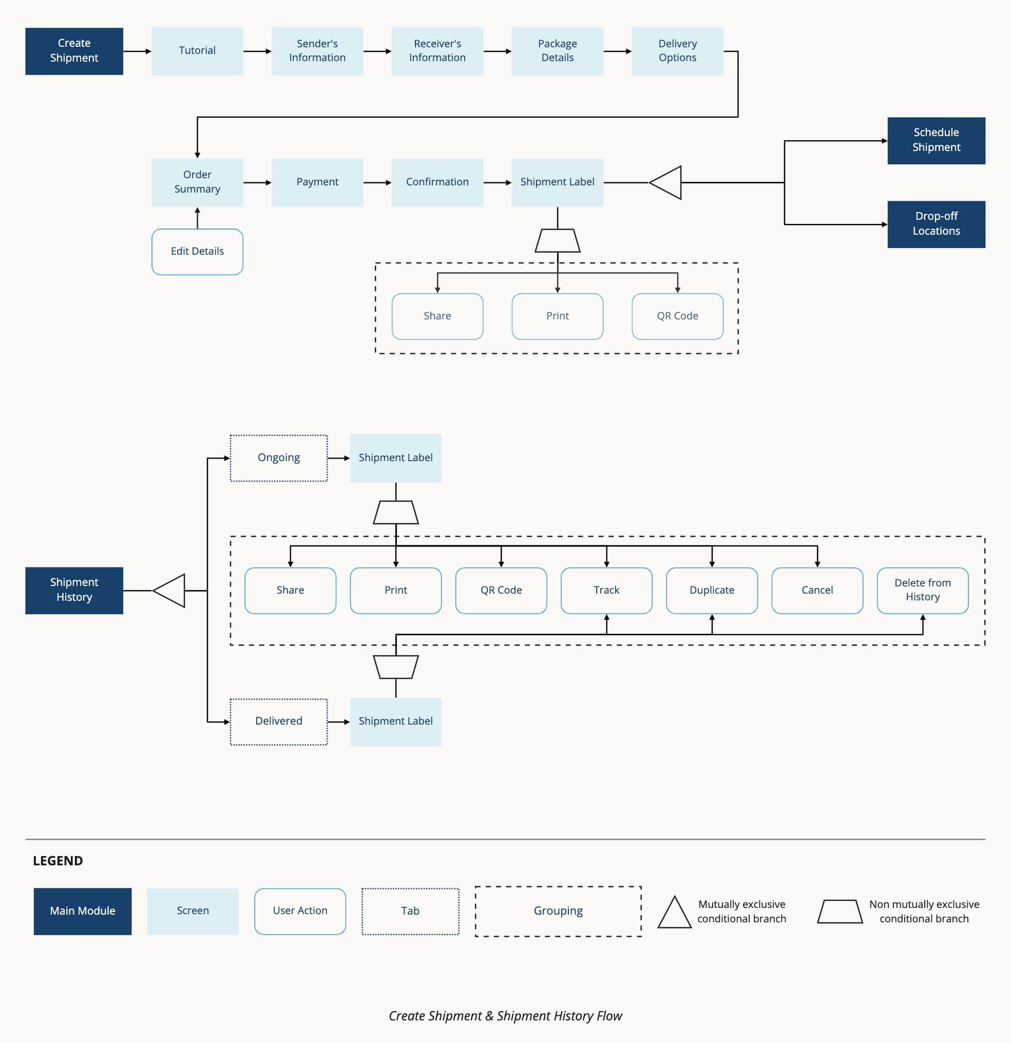
What steps does the user take to create a shipment?
Given the architecture of the app, the most evident entry-point for the create shipment flow was from the app's hamburger menu, where all other associated functionalities are housed. After many back and forth discussion with the client and the PMs, here's the end-to-end flow that we finalized:
Understanding the system model
Not reinventing the wheel
This new feature while being a standalone one, had to still fit cohesively with the rest of the app. So I spent some time understanding the app's system model and identifying opportunities for reusing existing components wherever possible.
Getting into techical weeds
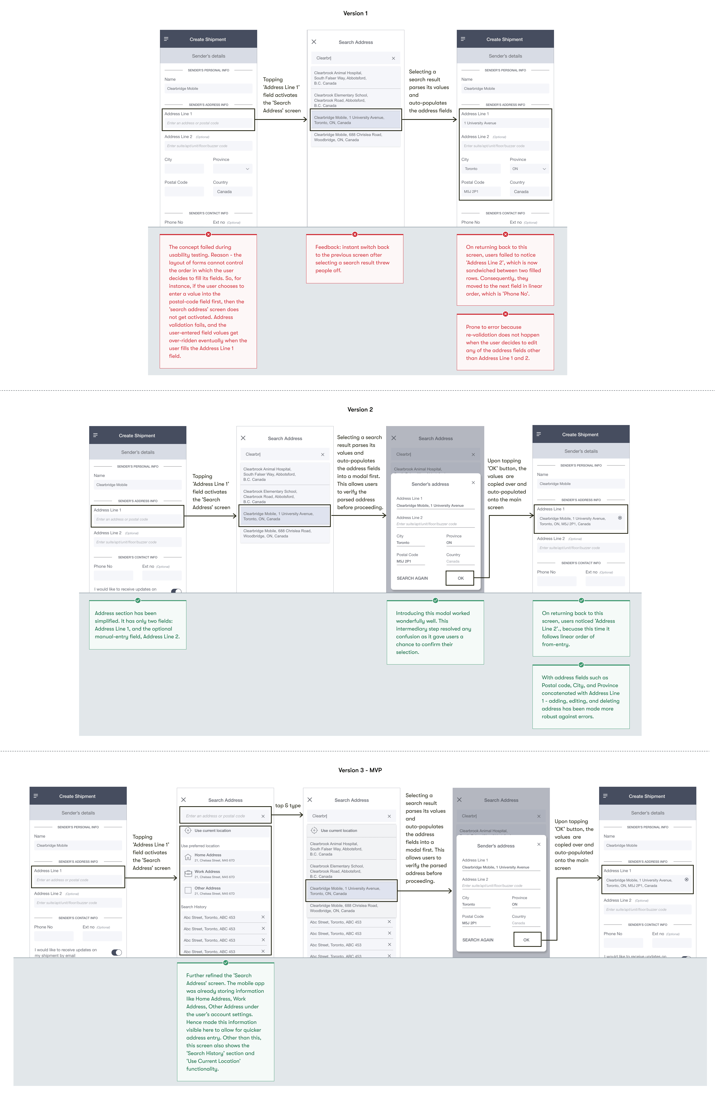
One enormous challenge for me was understanding and overcoming technical constraints. One, in particular, was understanding how the address search mechanism works. This meant deciphering the location API that developers were going to use. Ultimately, understanding how the data was being structured, queried, and returned played a key role in designing address form-fields.
Exploration & Iteration
Once I had the architecture figured out, I started wireframing. I detailed out all the screens involved in the end-to-end flow. At various points during the process, I would show my team the designs I was most confident about, get their feedback, conduct guerilla tests, and then go back to flesh out another iteration based on what didn't work. In the end every single detail was laid out, and I felt as if I was trying to assemble all these important puzzle pieces together before a concrete picture started forming.
A. Address Entry Iteration
Other than being intuitive enough, the address entry process had to satisfy various technical constraints. After throwing several ideas and flows onto paper, I picked one that I believed was a strong contender. Running quick guerilla tests on it, exposed several problems with it - refer to version 1. So I started refining it. Version 2 performed wonderfully well during the second round of guerilla tests. Ultimately, post feedback from the client, version 2 was further updated into the final version 3, which includes additional functionalities.
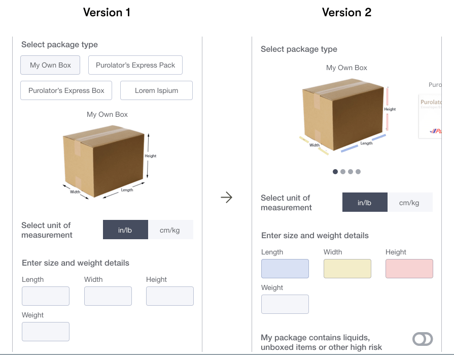
B. Package Selection iteration
Decreasing cognitive load
Refined version 2: Color-coding the size fields to map with the associated dimensions of the package. This avoids any mismatch between the conceptual model and user's mental model.
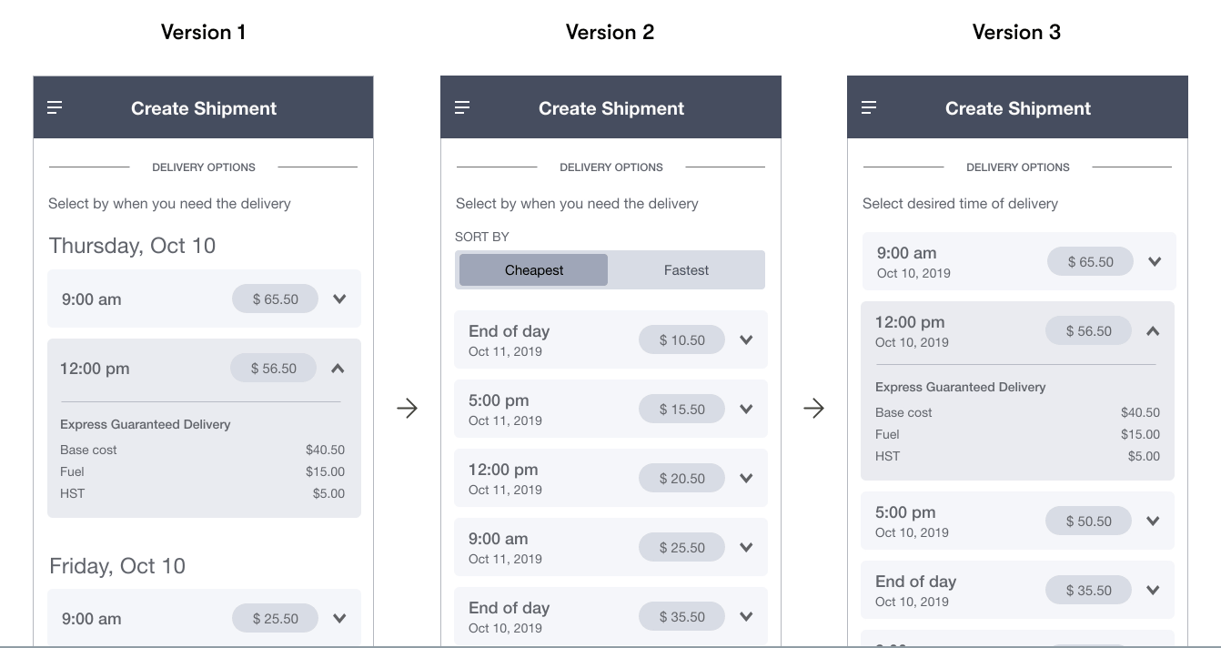
C. Delivery Option selection iteration
Progressive disclosure of information
- Version 1: The delivery option component is collapsed by default, revealing complex details like price breakdown only when the user taps to expand it. Visual emphasis is applied on the date, time, and price information, with the delivery options themselves segregated by dates.
- Version 2: Based on the usability tests, it was evident that users desired for segregation by price and time. While this version was the best contender, it did not end up being final.
- Version 3: Due to business constraints, any kind of segregation was to be avoided at the MVP stage. Also, it was required to put emphasis on selection by time over date. This led to the final version 3.
Style Guide & Form UI best practices
The Purolator app was built a long time ago. As a result, the designs lacked a modern look. While making designs for this new feature, I had some liberty to experiment with the designs as long as it stayed within the limits of the company's brand guidelines. So the first thing I did was create a design system around the existing guidelines. I also laid down some form-UI best design practices, which would come in handy for the developers.
Final Designs & Prototypes
End-to-end the Create Shipment & the Shipment History flow is as follows:
New feature onboarding
As Create Shipment is a new feature, letting users know how to use it is important. Thus, conditions for creating and managing shipping labels are called out upfront.
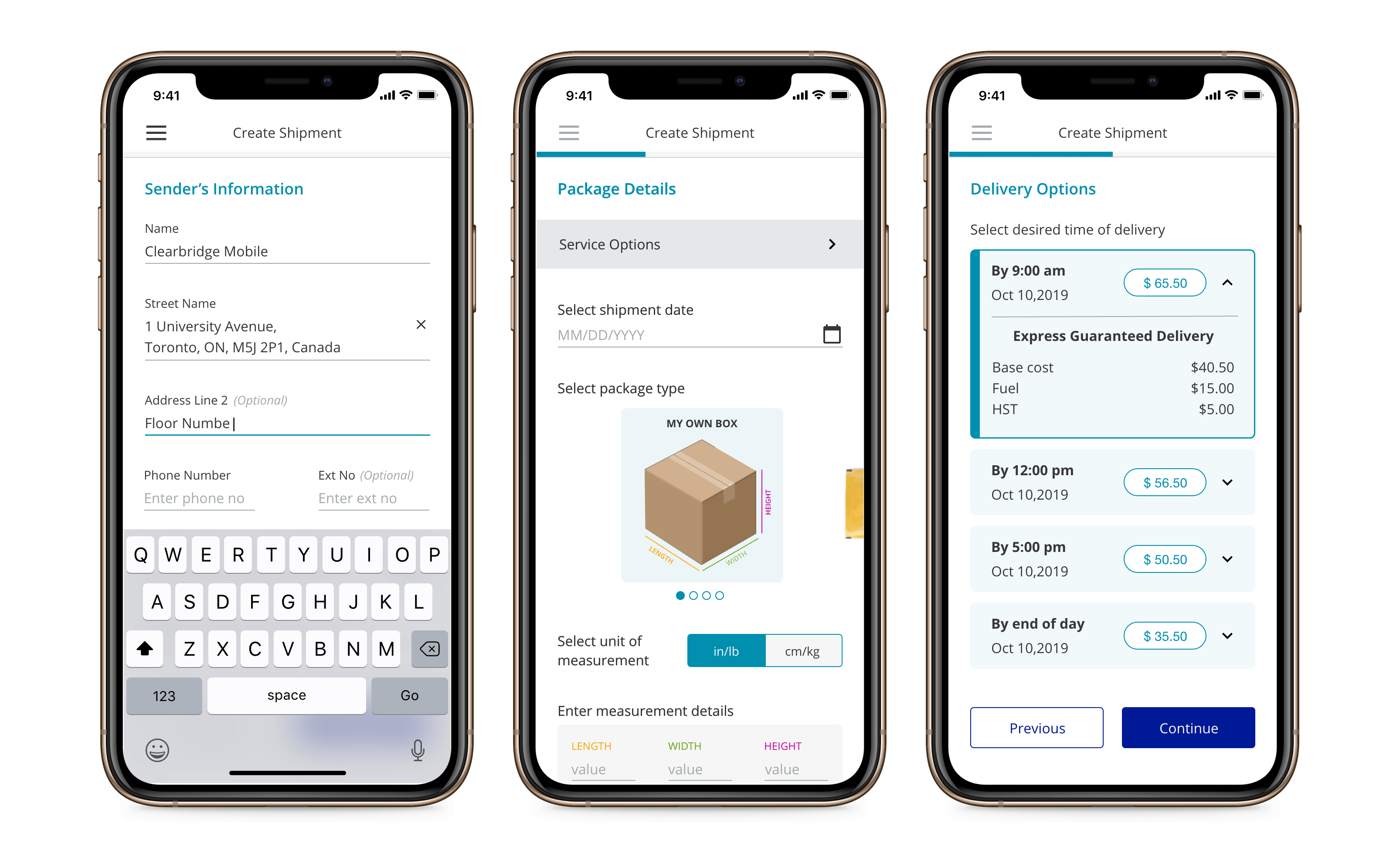
Sender and Recipient Information
- The create shipment workflow starts by collecting the sender's information, followed by the recipient's information.
- Geolocation and address prefilling techniques have been used to provide accurate address suggestions.
- The way address information has been captured makes adding, editing, and deleting it more robust against errors.
Package & Pricing information
- The third step in this process captures package information, including package type and dimensions.
- Color coding has been used for dimension values to avoid any mismatch between the conceptual model and the user's mental model.
- The fourth step in this process let's user select a delivery option. With a possibility of many options being displayed, making a choice has been deliberately made easy for the end user: by using progressive disclosure techniques and showing only the most relevant information upfront.
Review Order and Payment information
The user is given a chance to review all the information and make any updates to it if needed, before proceeding to make a payment.
Shipping Label
After the successful payment transaction, a shipping label is created. At this stage, the user can do one of the three things:
- Print off the shipping label and after sticking it to the package schedule it's pick up using the 'Schedule Shipment' functionality within the app.
- Print off the shipping label and after sticking it to the package drop-off the package at any of the Purolator's drop-boxes/post-office locations. Purolator's 'Find Location' functionality can be used to find the nearest drop-off locations.
- If the user doesn't have a printer, they can scan the generated QR code at any of the Purolator locations to get the shipping label printed. They will have to stick this shipping label to the package before dispatching it off.
Shipping History
- A copy of the label is saved in the Shipmnet History section of the app.
- From here, the user can perform several actions on the shipping label such as print, share, duplicate, cancel, track, or see its associated QR code.
Reflection
Embracing constraints
I had to work under very strict technical constraints. What I realized is that constraints don't necessarily impede creativity, but on the contrary, can provide a lot of focus and direction. I found the most effective approach was to embrace contraints and work together to find counter solutions.
Using the product
One thing that I learnt early on is that if I spend too much time looking at designs or discussing static pages that means I am making way too many assumptions. A great product works well, it doesn’t just look nice. Many UX issues are often invisible, only to be discovered when one starts using the product. Guerrilla testing at various stages, and inputs from the QA department on early proptotypes helped me a tonne in validating key concepts and moving fast.